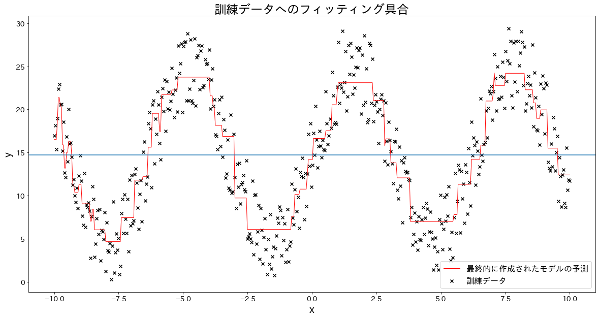
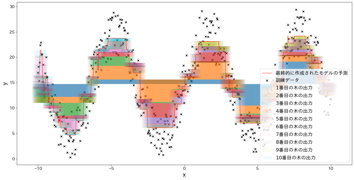
The key idea is to inspect not only the final curve but also each intermediate stage. Seeing where each tree adds or subtracts prediction mass makes the boosting mechanism concrete.
n_samples=500X=np.linspace(-10,10,n_samples)[:,np.newaxis]noise=np.random.rand(X.shape[0])*10y=(np.sin(X).ravel())*10+10+noisen_estimators=10learning_rate=0.5reg=GradientBoostingRegressor(n_estimators=n_estimators,learning_rate=learning_rate,)reg.fit(X,y)y_pred=reg.predict(X)plt.figure(figsize=(20,10))plt.scatter(X,y,c="k",marker="x",label="train")plt.plot(X,y_pred,c="r",label="final",linewidth=1)plt.xlabel("x")plt.ylabel("y")plt.axhline(y=np.mean(y),color="gray",linestyle=":",label="baseline")plt.title("Fitting on training data")plt.legend()plt.show()
foriinrange(5):fig,ax=plt.subplots(figsize=(20,10))plt.title(f"Up to tree {i+1}")temp=np.zeros(n_samples)+np.mean(y)forjinrange(i+1):res=reg.estimators_[j][0].predict(X)*learning_rateax.bar(X.flatten(),res,bottom=temp,label=f"{j+1}",alpha=0.05)temp+=resplt.scatter(X.flatten(),y,c="k",marker="x",label="train")plt.legend()plt.xlabel("x")plt.ylabel("y")plt.show()