Quantile Regression

2.1.7

Quantile Regression

Last updated 2020-04-22 Read time 3 min
Summary
  • Quantile regression directly estimates arbitrary quantiles—such as the median or the 10th percentile—instead of only the mean.
  • Minimizing the pinball loss yields robustness to outliers and accommodates asymmetric noise.
  • Independent models can be fit for different quantiles, and stacking them forms prediction intervals.
  • Feature scaling and regularization help stabilize convergence and maintain generalization.

Intuition #

This method should be interpreted through its assumptions, data conditions, and how parameter choices affect generalization.

Detailed Explanation #

Mathematical formulation #

With residual \(r = y - \hat{y}\) and quantile level \(\tau \in (0, 1)\), the pinball loss is defined as

$$ L_\tau(r) = \begin{cases} \tau r & (r \ge 0) \\ (\tau - 1) r & (r < 0) \end{cases} $$

Minimizing this loss yields a linear predictor for the \(\tau\)-quantile. Setting \(\tau = 0.5\) recovers the median and leads to the same solution as least absolute deviations regression.

Experiments with Python #

We use QuantileRegressor to estimate the 0.1, 0.5, and 0.9 quantiles and compare them with ordinary least squares.
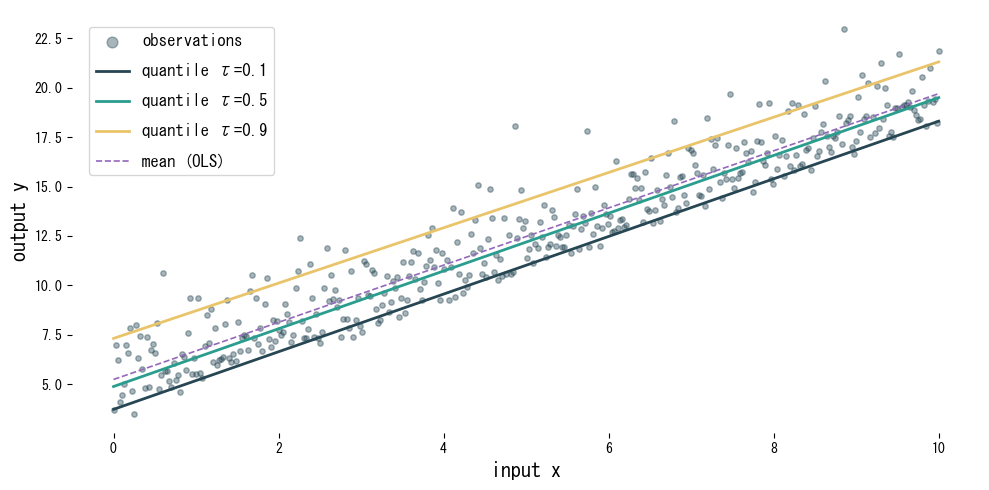
 1
 2
 3
 4
 5
 6
 7
 8
 9
10
11
12
13
14
15
16
17
18
19
20
21
22
23
24
25
26
27
28
29
30
31
32
33
34
35
36
37
38
39
40
41
42
43
44
45
46
47
48
49
50
51
52
53
54
55
56
57
58
59
60
61
62
63
64
65
66
67
68
69
70
71
72
73
74
75
76
77
78
79
80
81
82
83
84
85
86
87
88
89
from __future__ import annotations

import japanize_matplotlib
import matplotlib.pyplot as plt
import numpy as np
from sklearn.linear_model import LinearRegression, QuantileRegressor
from sklearn.pipeline import make_pipeline
from sklearn.preprocessing import StandardScaler

def run_quantile_regression_demo(
    taus: tuple[float, ...] = (0.1, 0.5, 0.9),
    n_samples: int = 400,
    xlabel: str = "input x",
    ylabel: str = "output y",
    label_observations: str = "observations",
    label_mean: str = "mean (OLS)",
    label_template: str = "quantile τ={tau}",
    title: str | None = None,
) -> dict[float, tuple[float, float]]:
    """Fit quantile regressors alongside OLS and plot the conditional bands.

    Args:
        taus: Quantile levels to fit (each in (0, 1)).
        n_samples: Number of synthetic observations to generate.
        xlabel: Label for the x-axis.
        ylabel: Label for the y-axis.
        label_observations: Legend label for the scatter plot.
        label_mean: Legend label for the OLS line.
        label_template: Format string for quantile labels.
        title: Optional title for the plot.

    Returns:
        Mapping of quantile level to (min prediction, max prediction).
    """
    japanize_matplotlib.japanize()
    rng = np.random.default_rng(123)

    x_values: np.ndarray = np.linspace(0.0, 10.0, n_samples, dtype=float)
    noise: np.ndarray = rng.gamma(shape=2.0, scale=1.0, size=n_samples) - 2.0
    y_values: np.ndarray = 1.5 * x_values + 5.0 + noise
    X: np.ndarray = x_values[:, np.newaxis]

    quantile_models: dict[float, make_pipeline] = {}
    for tau in taus:
        model = make_pipeline(
            StandardScaler(with_mean=True),
            QuantileRegressor(alpha=0.001, quantile=float(tau), solver="highs"),
        )
        model.fit(X, y_values)
        quantile_models[tau] = model

    ols = LinearRegression()
    ols.fit(X, y_values)

    grid: np.ndarray = np.linspace(0.0, 10.0, 200, dtype=float)[:, np.newaxis]
    preds = {tau: model.predict(grid) for tau, model in quantile_models.items()}
    ols_pred: np.ndarray = ols.predict(grid)

    fig, ax = plt.subplots(figsize=(10, 5))
    ax.scatter(X, y_values, s=15, alpha=0.4, label=label_observations)

    color_cycle = plt.rcParams["axes.prop_cycle"].by_key().get("color", ["#1f77b4", "#ff7f0e", "#2ca02c"])
    for idx, tau in enumerate(taus):
        color = color_cycle[idx % len(color_cycle)]
        ax.plot(
            grid,
            preds[tau],
            color=color,
            linewidth=2,
            label=label_template.format(tau=tau),
        )

    ax.plot(grid, ols_pred, color="#9467bd", linestyle="--", label=label_mean)
    ax.set_xlabel(xlabel)
    ax.set_ylabel(ylabel)
    if title:
        ax.set_title(title)
    ax.legend()
    fig.tight_layout()
    plt.show()

    summary: dict[float, tuple[float, float]] = {
        tau: (float(pred.min()), float(pred.max())) for tau, pred in preds.items()
    }
    return summary

summary = run_quantile_regression_demo()
for tau, (ymin, ymax) in summary.items():
    print(f"tau={tau:.1f}: min prediction {ymin:.2f}, max prediction {ymax:.2f}")

9 quantiles and compare them with ordinary least squares figure

Reading the results #

  • Each quantile produces a different line, capturing the vertical spread of the data.
  • Compared with the mean-focused OLS model, quantile regression adapts to skewed noise.
  • Combining multiple quantiles yields prediction intervals that communicate decision-relevant uncertainty.

References #

  • Koenker, R., & Bassett, G. (1978). Regression Quantiles. Econometrica, 46(1), 33–50.
  • Koenker, R. (2005). Quantile Regression. Cambridge University Press.