4.3.3
ROC-AUC
Summary
- Understand the fundamentals of this metric, what it evaluates, and how to interpret the results.
- Compute and visualise the metric with Python 3.13 code examples, covering key steps and practical checkpoints.
- Combine charts and complementary metrics for effective model comparison and threshold tuning.
- Sensitivity & Specificity — understanding this concept first will make learning smoother
1. What ROC and AUC represent #
The ROC curve traces False Positive Rate (FPR) on the x-axis and True Positive Rate (TPR) on the y-axis while sweeping the decision threshold from 0 to 1. The area under the curve (AUC) ranges between 0.5 (random guessing) and 1.0 (perfect separation).
- AUC ≈ 1.0 → excellent discrimination
- AUC ≈ 0.5 → indistinguishable from random
- AUC < 0.5 → the model may have flipped polarity; inverting the decision rule could improve performance
2. Implementation and plotting in Python 3.13 #
Check your interpreter and install the required packages:
| |
The code below trains a logistic regression model on the breast cancer dataset, draws the ROC curve, and saves the figure to static/images/eval/classification/rocauc. It is compatible with generate_eval_assets.py so you can refresh assets automatically.
| |
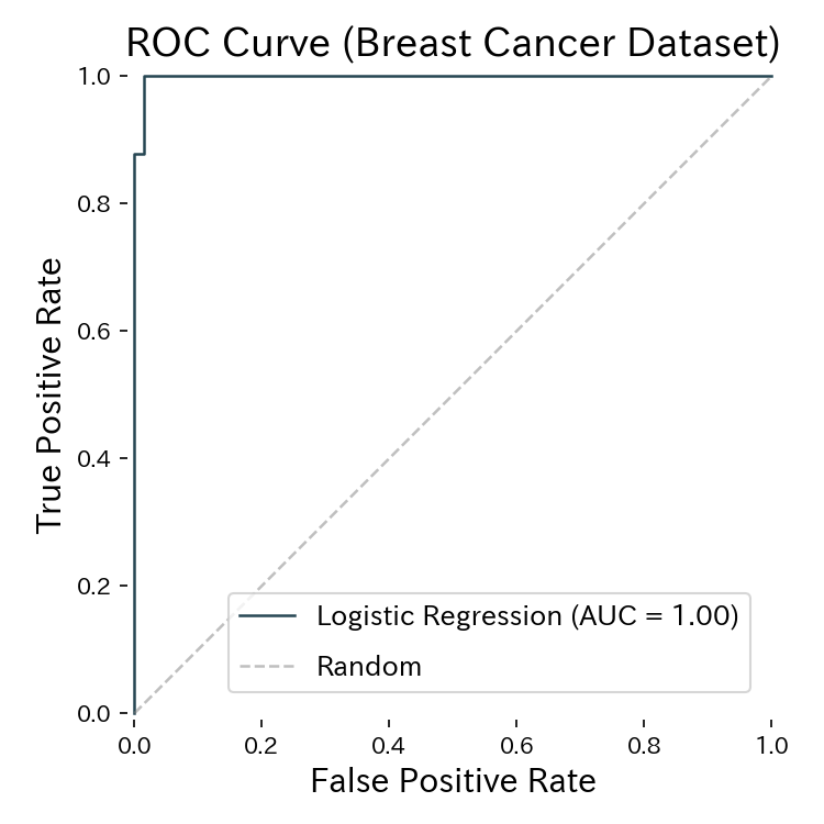
The AUC measures the area below the ROC curve; higher values indicate better ranking ability.
3. Using the curve for threshold tuning #
- Recall-sensitive domains (healthcare, fraud): move along the curve to pick a higher TPR while keeping FPR acceptable.
- Balancing precision vs. recall: models with high AUC typically maintain good performance across a wider range of thresholds.
- Model comparison: AUC provides a single scalar to compare classifiers before picking an operating point. Combine ROC-AUC with precision–recall analysis to understand the cost of altering the decision threshold.
4. Operational checklist #
- Inspect class imbalance – even with AUC close to 0.5, a different threshold might still rescue important cases.
- Evaluate class-weight strategies – adjust class weights or sample weights and verify whether AUC improves.
- Share the plot – include the ROC curve in dashboards so teams can reason about trade-offs.
- Keep a Python 3.13 notebook – reproduce the calculation effortlessly whenever the model is retrained.
Summary #
- ROC-AUC captures how well a classifier ranks positives ahead of negatives across all thresholds.
- In Python 3.13, RocCurveDisplay and oc_auc_score make computation and plotting straightforward.
- Use the curve in tandem with precision–recall metrics to choose operating thresholds aligned with business goals.