4.1.5
Learning curve
Summary
- A learning curve plots training vs. validation performance as the training sample size grows.
- Use
learning_curveto draw both curves, inspect bias/variance behaviour, and judge whether more data will help. - Apply the insights to data collection, model capacity, and feature engineering decisions.
- Cross-Validation — understanding this concept first will make learning smoother
1. What is a learning curve? #
A learning curve tracks training score and validation score while gradually increasing the number of training samples. It helps answer:
- Is the model underfitting (high bias) or overfitting (high variance)?
- Would collecting more data meaningfully improve performance?
- Should we revisit hyperparameters or model architecture?
2. Python example (Ridge regression) #
| |
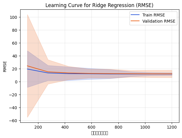
As sample size increases, training RMSE worsens while validation RMSE improves and eventually stabilises. Once the curves converge, adding more data yields diminishing returns.
3. Interpreting the curves #
- High variance / overfitting: training score is very good but validation score lags far behind. Try stronger regularisation, fewer features, or more data.
- High bias / underfitting: both curves are high (poor). Use a more expressive model, engineer features, or loosen regularisation.
- Converged curves: training and validation scores meet; more data will not change much and you may need a different model or features.
4. Practical applications #
- Data collection ROI: if the validation curve is still improving, additional data is valuable; if it plateaus, prioritise other work.
- Model capacity & regularisation: inspect the curve before adjusting tree depth, neural network width, or regularisation strength.
- Feature engineering: when both curves run parallel at a high error level, richer features can unlock performance.
- Combine with other diagnostics: pair with validation curves or time-series evaluations to plan iteration cycles.
Summary #
- Learning curves expose overfitting vs. underfitting and quantify the impact of training data size.
learning_curvemakes it easy to generate the plot; leverage it when planning data acquisition and tuning cadence.- Use it alongside other diagnostics to balance data, model complexity, and business priorities.