4.1.3
Validation curve
Summary
- Validation curves visualise how training and validation scores change when a single hyperparameter varies.
- Use
validation_curveto sweep a regularisation coefficient, plot both curves, and spot the sweet spot. - Learn how to interpret the graph when tuning hyperparameters and what caveats to keep in mind.
- Cross-Validation — understanding this concept first will make learning smoother
1. What is a validation curve? #
A validation curve plots a given hyperparameter on the x-axis and both training/validation scores on the y-axis. Typical interpretation:
- Training high, validation low → the model is overfitting; increase regularisation or decrease model capacity.
- Both scores low → underfitting; relax regularisation or choose a more expressive model.
- Both scores high and close → near an optimal setting; confirm with additional metrics.
While a learning curve analyses “sample size vs. score”, a validation curve analyses “hyperparameter vs. score”.
2. Python example (SVC with C)
#
| |
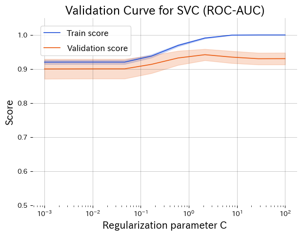
Lower C over-regularises, higher C overfits. The peak around C ≈ 1 gives the best validation score.
3. Reading the graph #
- Left side (small C): strong regularisation causes underfitting; both scores are low.
- Right side (large C): weak regularisation leads to high training score but falling validation score (overfitting).
- Middle peak: training and validation curves converge, indicating a good trade-off.
4. Applying it in practice #
- Pre-tune exploration: identify a promising hyperparameter range before running expensive searches (grid, random, Bayesian).
- Check variance: look at the shaded error bands (standard deviation) to judge stability, especially with small datasets.
- Prioritise multiple parameters: create validation curves for key parameters to decide which ones deserve deeper search.
- Combine with learning curves: understand “what hyperparameter works” and “whether more data helps” simultaneously.
Validation curves make the direction of hyperparameter tuning intuitive and support decision-making across the team. Keeping these plots for each production model streamlines discussions about next steps.