A radar chart is one method of comparing multiple items together. It is useful when checking whether multiple items are balanced high or low.
It is easier to compare when all items are either “higher the better” or “lower the better”.
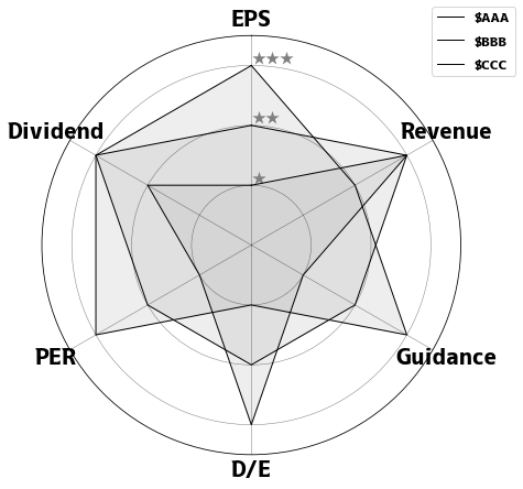
A radar chart is a graph that expresses a variable with multiple items on a regular polygon without converting it into a composition ratio. The center of the chart is 0, and the larger the value of each item, the further outward it is represented. It is mainly used to compare the performance of entities that have these items as attributes.
 1
 2
 3
 4
 5
 6
 7
 8
 9
10
11
12
13
14
15
| import matplotlib.pyplot as plt
import pandas as pd
from math import pi
df = pd.DataFrame(
index=["$AAA", "$BBB", "$CCC"],
data={
"EPS": [1, 2, 3],
"Revenue": [3, 3, 2],
"Guidance": [1, 2, 3],
"D/E": [3, 2, 1],
"PER": [1, 2, 3],
"Dividend": [2, 3, 3],
},
)
|
Plotting a radar chart
#
 1
 2
 3
 4
 5
 6
 7
 8
 9
10
11
12
13
14
15
16
17
18
19
20
21
22
23
24
25
26
27
| plt.figure(figsize=(7, 7))
ax = plt.subplot(111, polar=True)
ax.set_theta_offset(pi / 2.0)
ax.set_theta_direction(-1)
# adjust the position of each label
angles = [2 * n * pi / len(df.columns) for n in range(len((df.columns)))]
plt.xticks(angles, df.columns, size=20)
ax.set_rlabel_position(0)
plt.yticks([1, 2, 3], ["★", "★★", "★★★"], color="grey", size=13)
plt.ylim(0, 3.5)
# Fill in the specified area
for ticker_symbol in ["$AAA", "$BBB", "$CCC"]:
values = df.loc[ticker_symbol].values.flatten().tolist()
ax.plot(
angles + [0],
values + [values[0]],
linewidth=1,
linestyle="solid",
c="#000",
label=ticker_symbol,
)
ax.fill(angles + [0], values + [values[0]], "#aaa", alpha=0.2)
plt.legend(bbox_to_anchor=(0.9, 1.1))
plt.show()
|