5.10.1
Check Dataset
See what’s in the data #
| |
Reading a dataset from a csv file #
| |
| Date | Temp | |
|---|---|---|
| 0 | 1981-01-01 | 20.7 |
| 1 | 1981-01-02 | 17.9 |
| 2 | 1981-01-03 | 18.8 |
| 3 | 1981-01-04 | 14.6 |
| 4 | 1981-01-05 | 15.8 |
| 5 | 1981-01-06 | 15.8 |
| 6 | 1981-01-07 | 15.8 |
| 7 | 1981-01-08 | 17.4 |
| 8 | 1981-01-09 | 21.8 |
| 9 | 1981-01-10 | 20.0 |
Set timestamp to datetime #
The Date column is currently read as an Object type, i.e., a string. To treat it as a timestamp, use the following datetime — Basic Date and Time Types to convert it to a datetime type.
| |
Date column dtype: datetime64[ns]
Get an overview of a time series #
pandas.DataFrame.describe #
To begin, we briefly review what the data looks like. We will use pandas.DataFrame.describe to check some simple statistics for the Temp column.
| |
| Temp | |
|---|---|
| count | 3650.000000 |
| mean | 11.177753 |
| std | 4.071837 |
| min | 0.000000 |
| 25% | 8.300000 |
| 50% | 11.000000 |
| 75% | 14.000000 |
| max | 26.300000 |
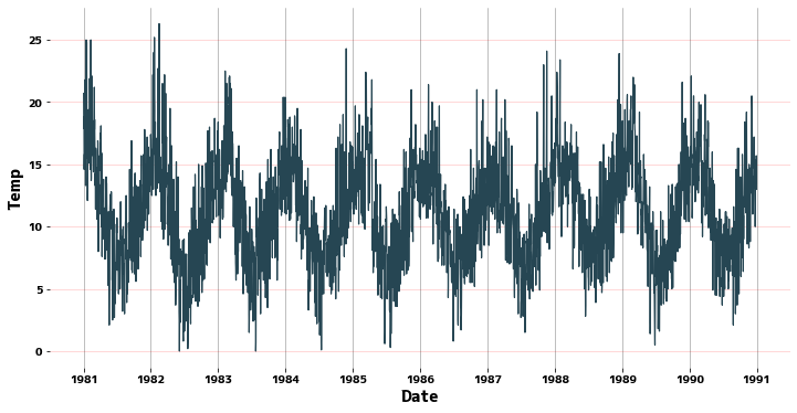
Line graph #
Use seaborn.lineplot to see what the cycle looks like.
| |
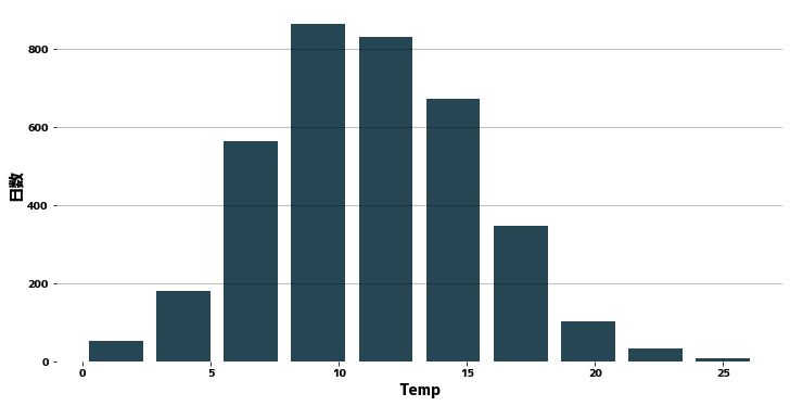
Histogram #
| |
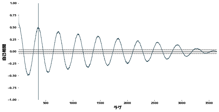
Autocorrelation and Cholerograms #
Using pandas.plotting.autocorrelation_plot Check autocorrelation to check the periodicity of time series data. Roughly speaking, autocorrelation is a measure of how well a signal matches a time-shifted signal of itself, expressed as a function of the magnitude of the time shift.
| |
Unit Root Test #
We check to see if the data are a unit root process. The Augmented Dickey-Fuller test is used to test the null hypothesis of a unit root process.
statsmodels.tsa.stattools.adfuller
| |
(-4.444804924611697,
 0.00024708263003610177,
 20,
 3629,
 {'1%': -3.4321532327220154,
  '5%': -2.862336767636517,
  '10%': -2.56719413172842},
 16642.822304301197)
Checking the trend #
The trend line is drawn by fitting a one-dimensional polynomial to the time series. Since the data in this case is almost trend-stationary, there is almost no trend.
numpy.poly1d — NumPy v1.22 Manual
| |
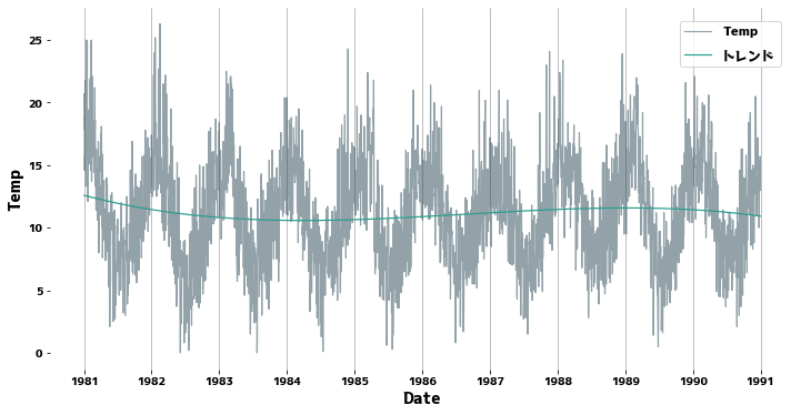
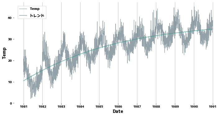
Supplement: If there is a clear trend #
The green line is the trend line.
| |
- Handling Trend Components — Preprocess series with mixed cycles and trends