6
Visualize
Use this gallery as a practical guide to pick effective charts, compare alternatives, and tell clearer data stories. Each card links to a focused recipe you can adapt in Python.
Bar Charts #
 Simple Bar |  Stacked Bar |  Waffle Chart |
|---|
Compare categories, parts-to-whole, and compact overviews. Start simple; add stacks or waffle charts when proportions matter.
Line Charts #
 Multiple Line Plot | 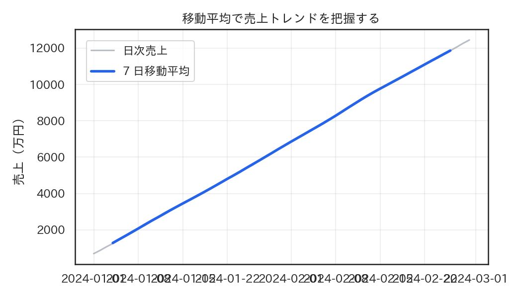 Rolling Average |  Sparkline |
|---|
Show trends, compare series, or smooth noise. Sparklines work well in dense tables or dashboards.
Scatter Charts #
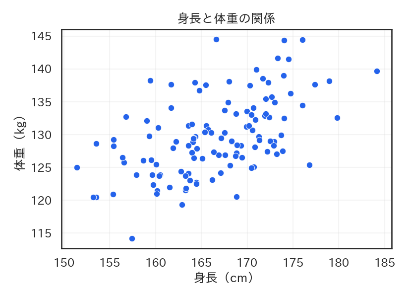 Basic Scatter | 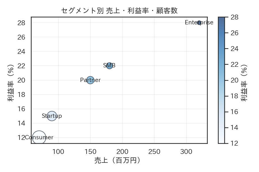 Bubble Chart | 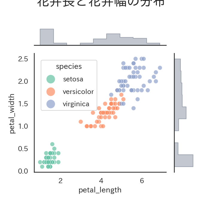 Scatter + Marginal Hist |
|---|
Reveal relationships, clusters, and outliers. Use marginals to show each variable’s distribution alongside the scatter.
Distributions #
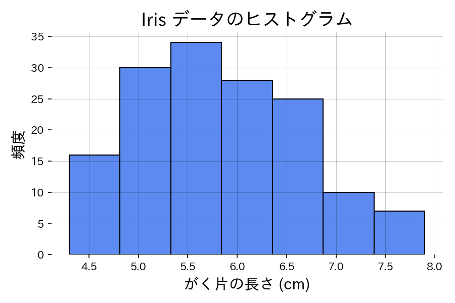 Histogram | 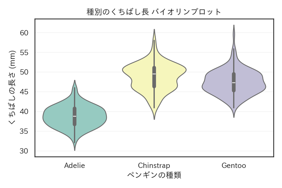 Violin Plot | 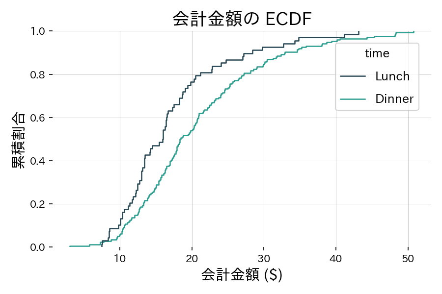 ECDF |
|---|
Understand shapes, tails, and comparisons at a glance. ECDFs are great for side‑by‑side comparisons without binning.
Correlation & Relationships #
 Correlation Heatmap |  Scatter Matrix |
|---|
Quickly scan relationships between variables. Heatmaps give a bird’s‑eye view; scatter matrices expose patterns pair‑by‑pair.
Category Grouping #
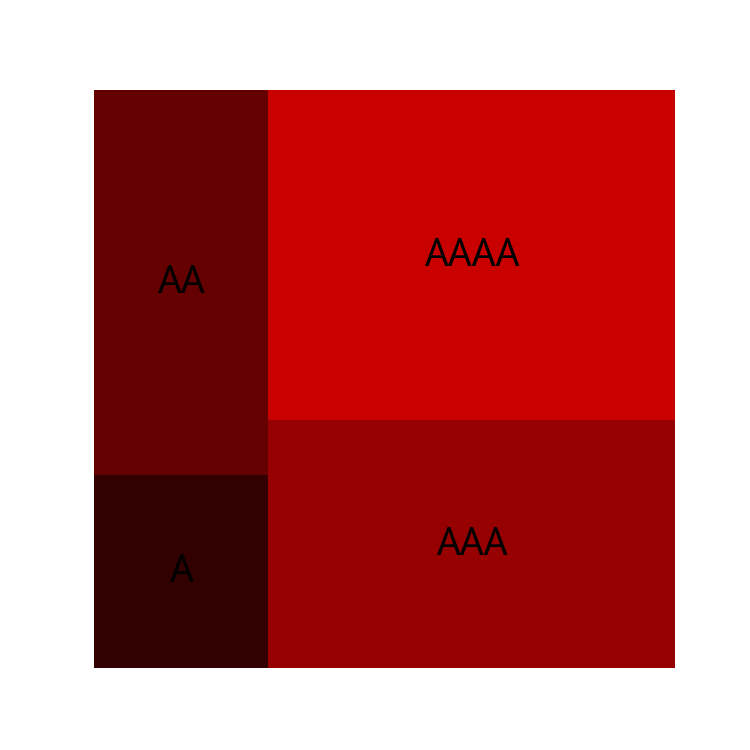 Treemap | 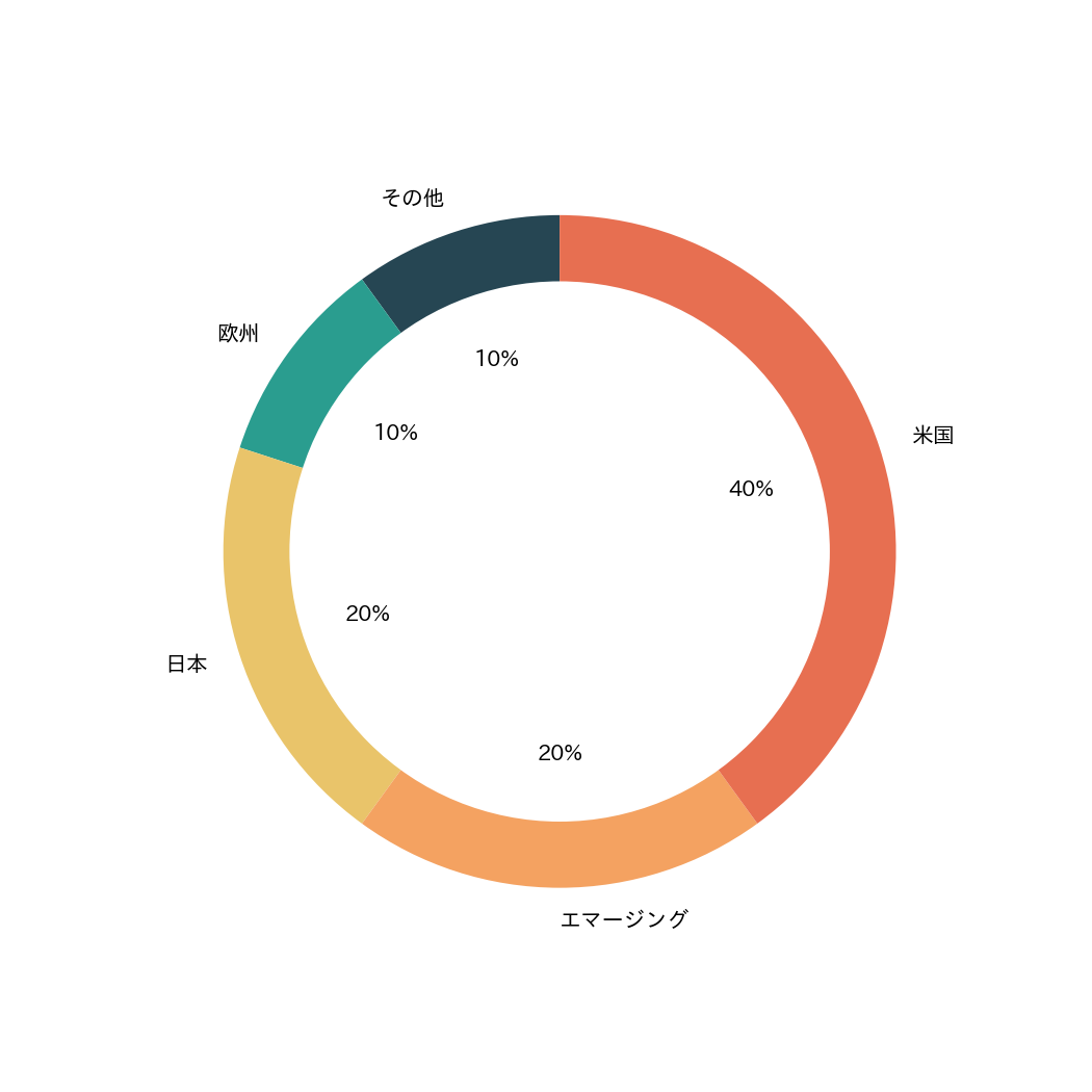 Pie & Donut | 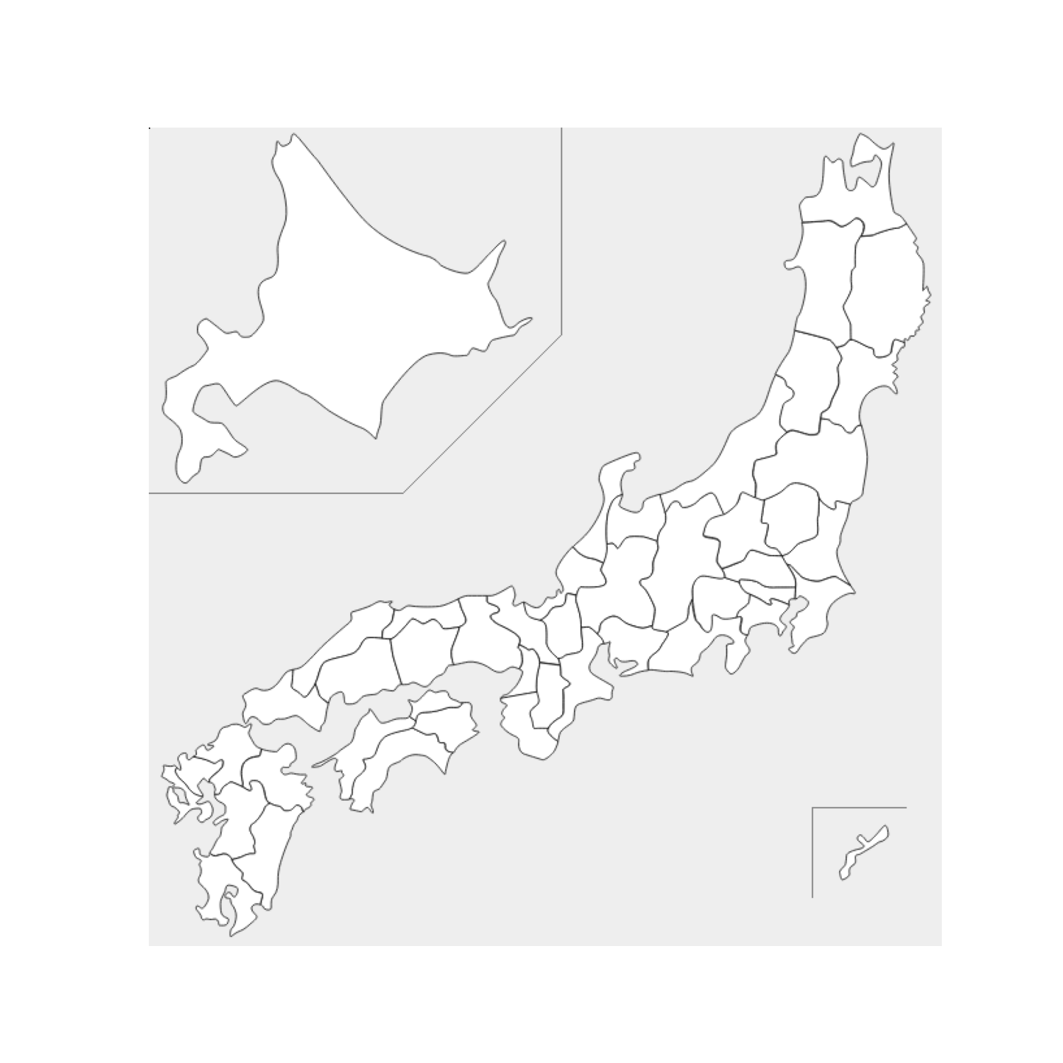 Japan Map |
|---|
Summarize hierarchical or regional categories. Treemaps compact space; pies work for a few slices; maps add geographic context.
Advanced Visualizations #
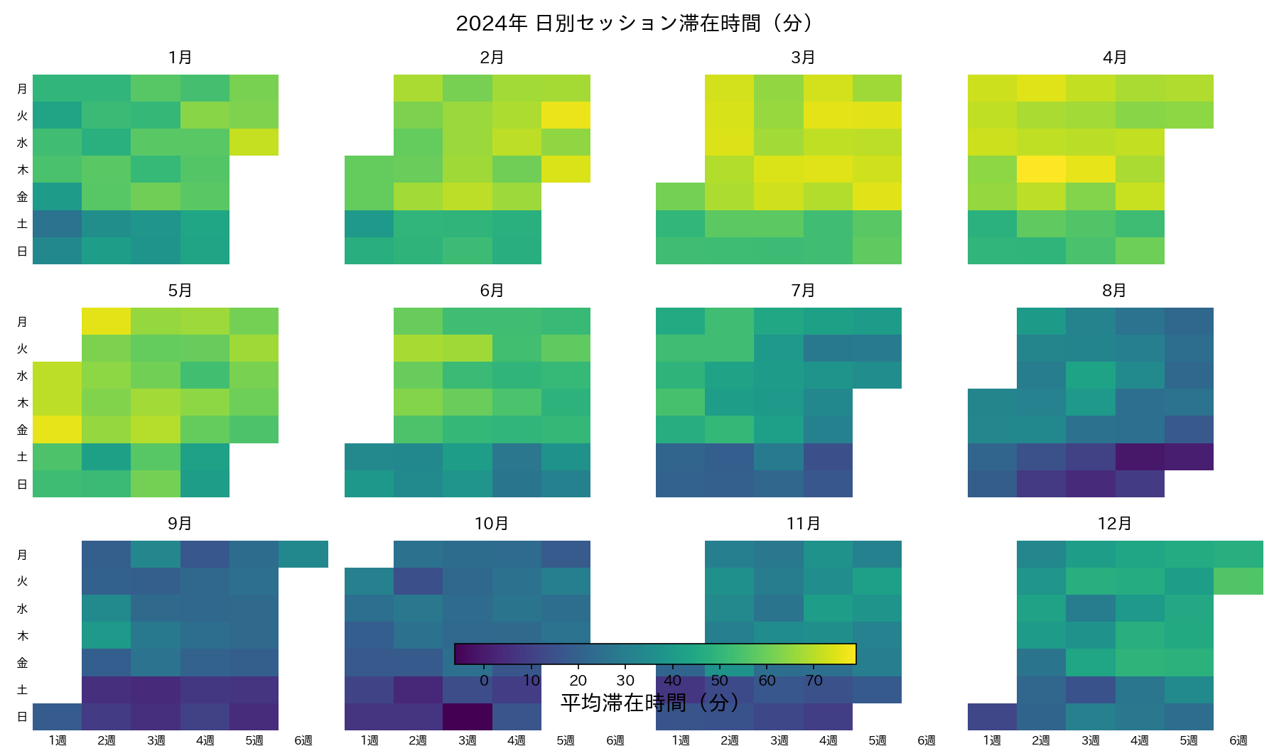 Calendar Heatmap | 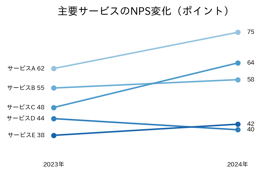 Slopegraph | 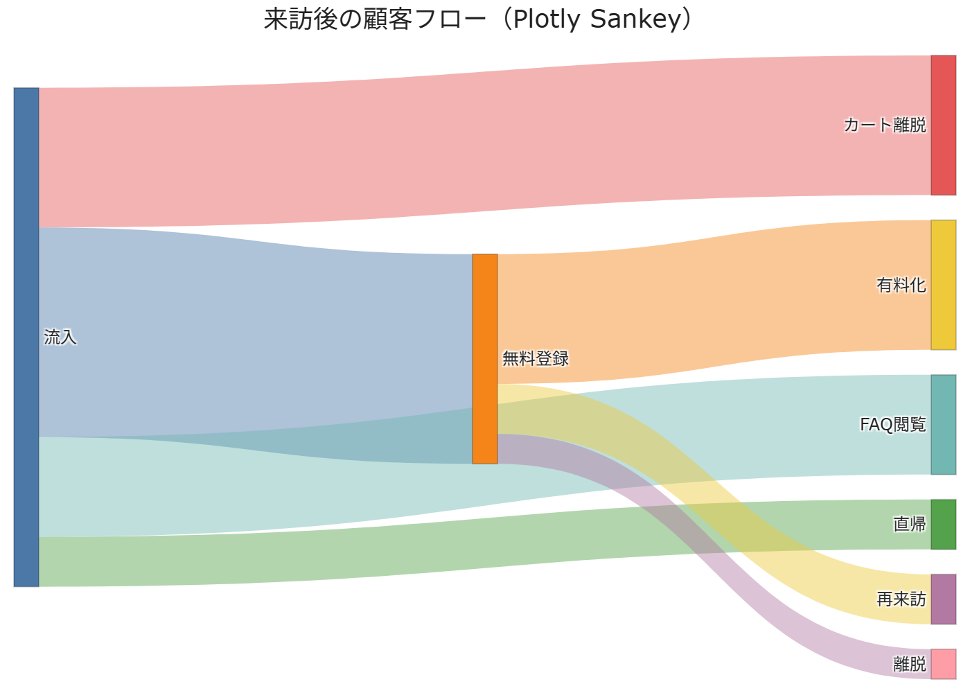 Sankey Diagram |
|---|
Patterns for time, flows, and change. Use these when simple bars or lines can’t clearly convey structure or movement.
This Visualize section links to runnable Python recipes. Adapt them to your data, then layer annotations and color for clear storytelling.