6.1.4
Sankey Diagram
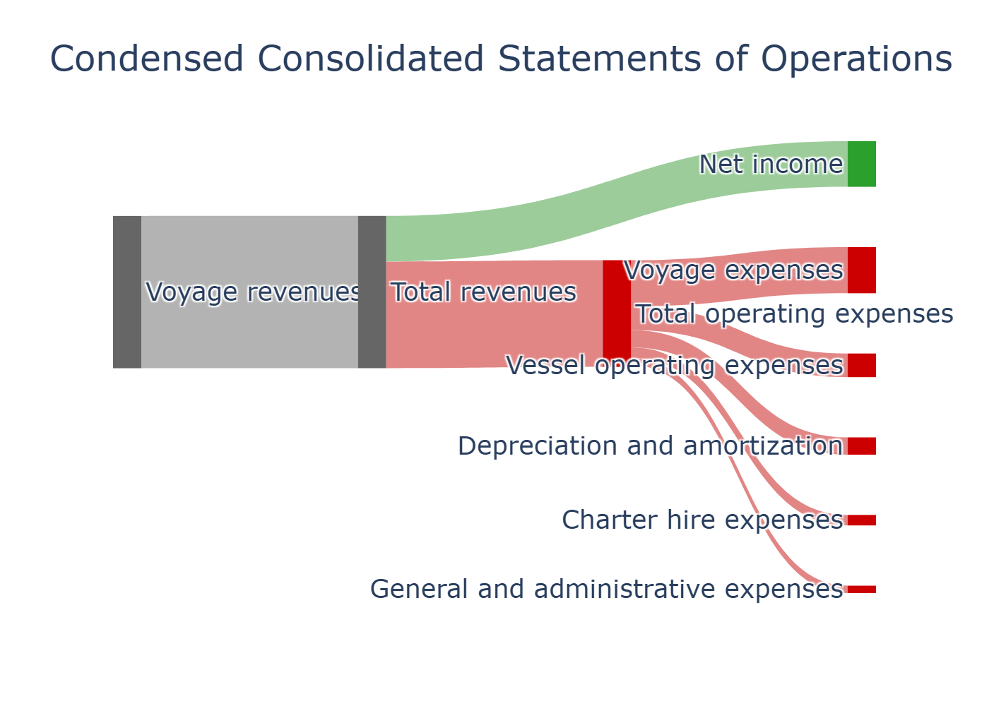
Sankey diagrams are charts that represent the flow rate between steps and can be utilized to visualize how the allocation of amounts and resources is changing. The thickness of the line indicates the amount of flow allocated. This page uses plotly to create a sankey diagram in python.
Please note that the following is a visualization of profit and loss for one period for “Genco Shipping & Trading Limited” and not the latest data.
| |
- Funnel Chart — Show drop-off per step via band width
- Treemap — Compare hierarchical values by area