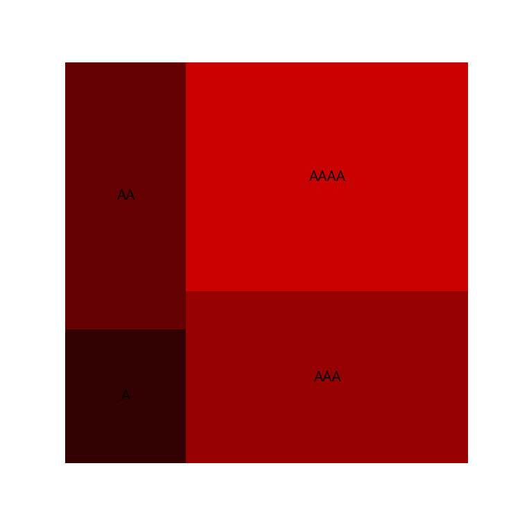
A treemap is a diagram that can be used to visualize numerical data with hierarchical categories. A typical example is a heat map of the Nikkei 225 or the S&P 500 . This notebook uses squarify .
 1
 2
 3
 4
 5
 6
 7
 8
 9
10
11
12
13
14
15
import numpy as np
import matplotlib.pyplot as plt
import japanize_matplotlib
import squarify
np . random . seed ( 0 ) # Fix random numbers
labels = [ "A" * i for i in range ( 1 , 5 )]
sizes = [ i * 10 for i in range ( 1 , 5 )]
colors = [ "# %02x%02x%02x " % ( i * 50 , 0 , 0 ) for i in range ( 1 , 5 )]
plt . figure ( figsize = ( 5 , 5 ))
squarify . plot ( sizes , color = colors , label = labels )
plt . axis ( "off" )
plt . show ()
Visualize my portfolio
# Suppose I have data on the acquisition price and current price for each stock I own.
From there, I would create a heatmap like finviz .
Suppose we read the following data from csv.
※The data shown here are fictitious.
 1
 2
 3
 4
 5
 6
 7
 8
 9
10
11
12
13
14
15
16
17
import pandas as pd
data = [
[ "PBR" , 80.20 , 130.00 ],
[ "GOOG" , 1188.0 , 1588.0 ],
[ "FLNG" , 70.90 , 230.00 ],
[ "ZIM" , 400.22 , 630.10 ],
[ "GOGL" , 120.20 , 90.90 ],
[ "3466 \n ラサールロジ" , 156.20 , 147.00 ], # 日本語表示のテスト用
]
df = pd . DataFrame ( data )
df . columns = [ "銘柄名" , "取得価額" , "現在の価額" ]
df [ "評価損益" ] = df [ "現在の価額" ] - df [ "取得価額" ]
df . head ( 6 )
plt . show ()
銘柄名 取得価額 現在の価額 評価損益 0 PBR 80.20 130.0 49.80 1 GOOG 1188.00 1588.0 400.00 2 FLNG 70.90 230.0 159.10 3 ZIM 400.22 630.1 229.88 4 GOGL 120.20 90.9 -29.30 5 3466\nラサールロジ 156.20 147.0 -9.20
Specify the color of the treemap.
# Green for profitable areas and red for loss areas.
 1
 2
 3
 4
 5
 6
 7
 8
 9
10
11
12
13
14
15
16
17
18
19
20
21
colors = []
percents = []
for p_or_l , oac in zip ( df [ "評価損益" ], df [ "取得価額" ]):
percent = p_or_l / oac * 100
if p_or_l > 0 :
g = np . min ([ percent * 255 / 100 + 100 , 255.0 ])
color = "# %02x%02x%02x " % ( 0 , int ( g ), 0 )
colors . append ( color )
else :
r = np . min ([ - percent * 255 / 100 + 100 , 255 ])
color = "# %02x%02x%02x " % ( int ( r ), 0 , 0 )
colors . append ( color )
percents . append ( percent )
print ( df [ "銘柄名" ] . values )
print ( colors )
print ( percents )
plt . show ()
['PBR' 'GOOG' 'FLNG' 'ZIM' 'GOGL' '3466\nラサールロジ']
['#00ff00', '#00b900', '#00ff00', '#00f600', '#a20000', '#730000']
[62.094763092269325, 33.670033670033675, 224.4005641748942, 57.43840887511868, -24.376039933444257, -5.8898847631241935]
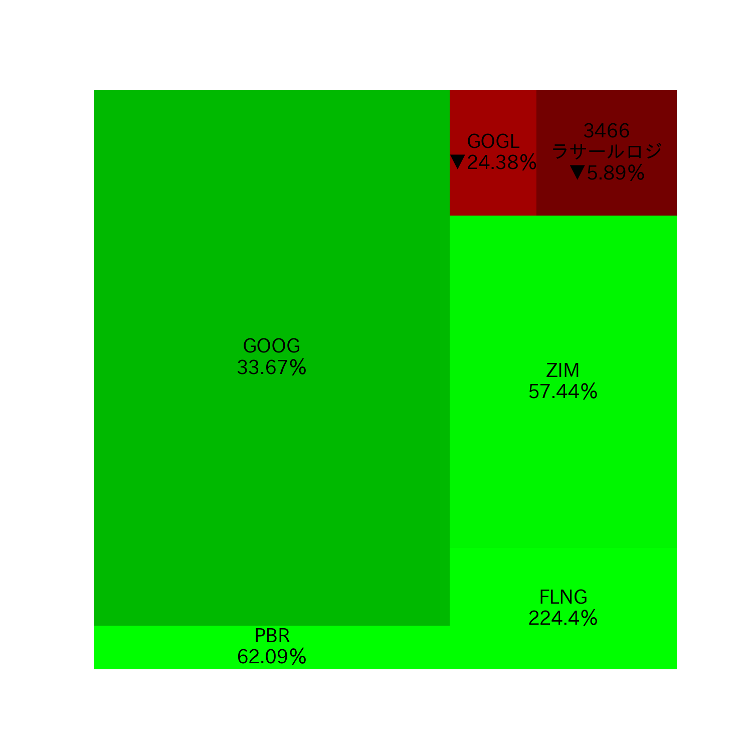
Displaying a treemap
# Let’s display the profit/loss in colors and the percentage of profit/loss on the treemap.
Japanese characters are not garbled because import japanize_matplotlib is used at the beginning.
 1
 2
 3
 4
 5
 6
 7
 8
 9
10
11
current_prices = [ cp for cp in df [ "現在の価額" ]]
labels = [
f " { name } \n { np . round ( percent , 2 ) } %" . replace ( "-" , "▼" )
for name , percent in zip ( df [ "銘柄名" ], percents )
]
plt . figure ( figsize = ( 10 , 10 ))
plt . rcParams [ "font.size" ] = 18
squarify . plot ( current_prices , color = colors , label = labels )
plt . axis ( "off" )
plt . show ()
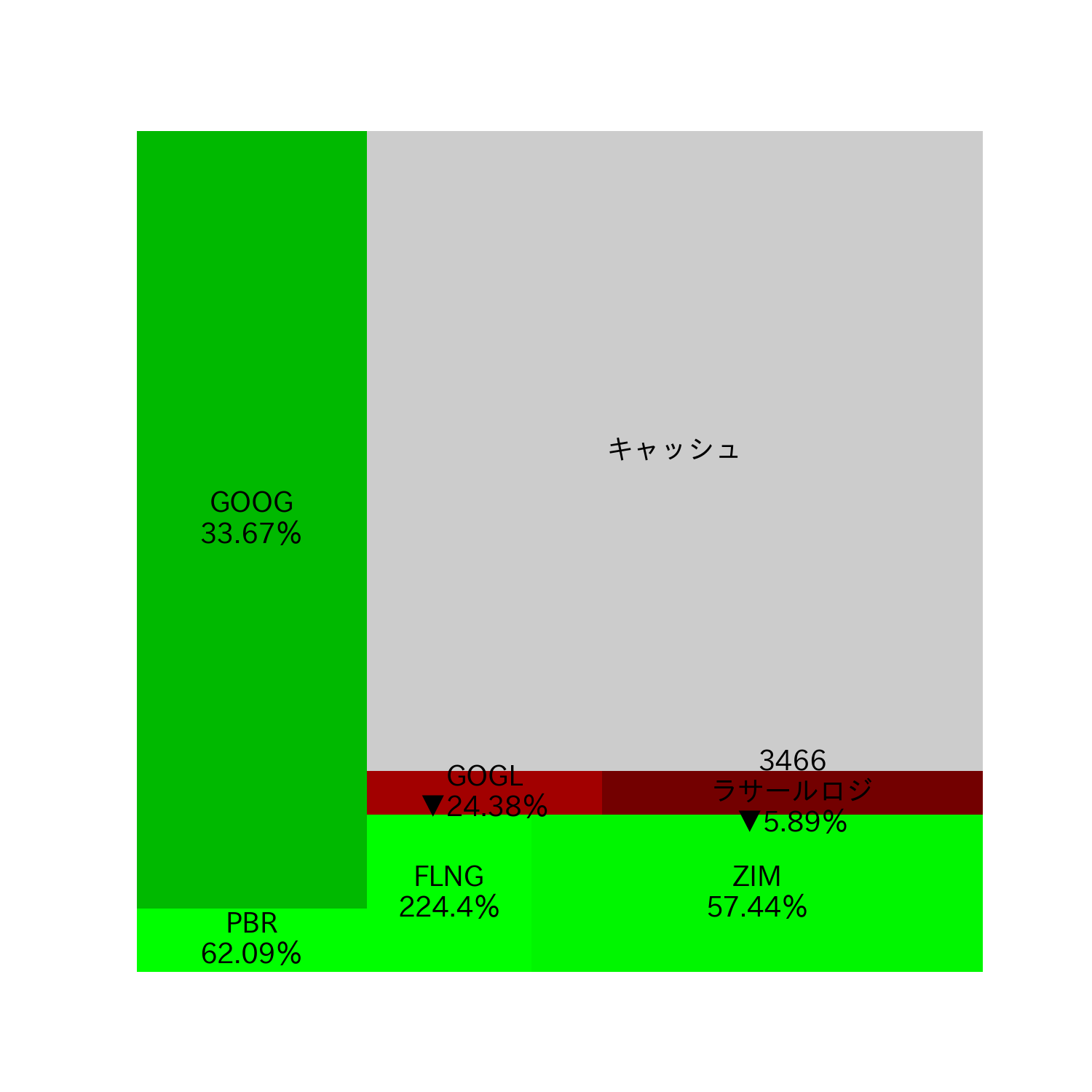
Add cache display to the treemap
# Let’s also add a cache display to the treemap. The color should be gray.
1
2
3
4
5
6
7
plt . figure ( figsize = ( 10 , 10 ))
plt . rcParams [ "font.size" ] = 18
squarify . plot (
current_prices + [ 3500 ], color = colors + [ "#ccc" ], label = labels + [ "キャッシュ" ]
)
plt . axis ( "off" )
plt . show ()
Donut Chart — Visually represent proportions with a circle