6.2.5
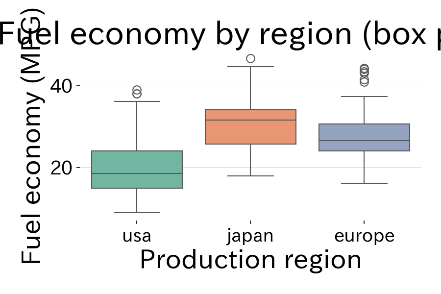
Summarize distributions with box plots
Box plots are a staple chart for showing the median, quartiles, and outliers with a single glyph. Comparing categories makes differences in dispersion immediately visible.
| |
Reading tips #
- The box represents the interquartile range (IQR) and the line in the middle is the median. Whiskers typically extend to 1.5×IQR.
- When there are too many outliers, inspect them with another chart or relax the upper bound.
- Flipping the plot horizontally keeps long labels readable.
- Violin Plot — Show distribution shape with box plot + KDE
- Histogram — Show frequency distribution with bins
- Swarm Plot — Arrange individual data points without overlap