6.2.7
Visualize cumulative distributions with ECDF
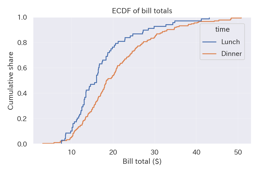
An empirical cumulative distribution function (ECDF) is a simple chart that shows the share of samples below any given value. It is handy for making threshold decisions.
| |
Reading tips #
- Segments where the slope is steep indicate that many samples cluster there, while flat portions mean the values are spread out.
- Statements such as “80% of customers spend less than $30” become easy to justify.
- When comparing many series, limit the number of colors and rely on legends and line styles for clarity.
- Histogram — Show frequency distribution with bins
- Q-Q Plot — Visually assess fit to a theoretical distribution
- Density Plot — Visualize distribution with a smooth curve