6.2.6
Visualize density with 2D KDE contours
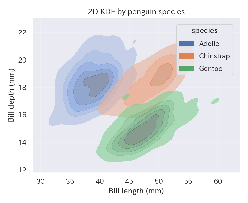
seaborn.kdeplot can draw the joint density of two variables as contours or filled areas. It is especially helpful when a scatter plot becomes overcrowded.
| |
Reading tips #
- Tighter contours indicate denser regions, and the color intensity provides an intuitive sense of frequency.
- Tune
threshto drop very low-density rings and keep the figure clean. - For very large data sets, KDE can be expensive, so consider sampling or adjusting
bw_adjustto widen the bandwidth.
- Density Plot — Visualize distribution with a smooth curve
- Hexbin Plot — Aggregate scatter density with hexagonal bins
- Density Plot — understanding this concept first will make learning smoother