6.2.8
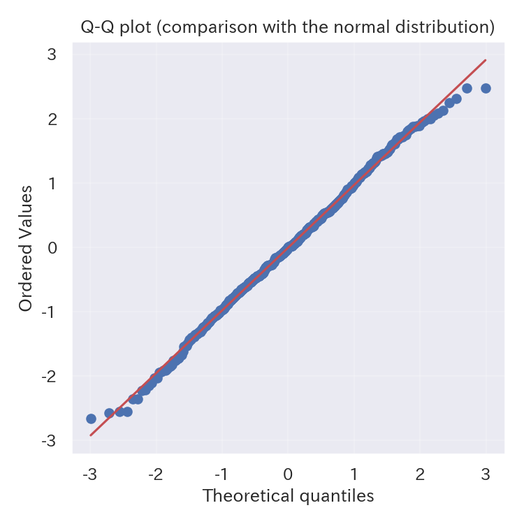
Check normality with a Q-Q plot
With scipy.stats.probplot you can inspect how closely your data follows a normal distribution. Points that stray far from the reference line indicate stronger departures from normality.
| |
Reading tips #
- If the points lie on the 45° line, the data is close to normal. Curved tails suggest heavy or light tails.
- To test another theoretical distribution, change the
distargument. - Reporting the sample mean and variance alongside the plot helps others interpret the distribution.
- ECDF — Check the proportion below a threshold via cumulative ratio
- Histogram — Show frequency distribution with bins
- Density Plot — Visualize distribution with a smooth curve