Show individual observations with a rug plot

6.2.10

Show individual observations with a rug plot

Last updated 2020-06-03 Read time 1 min

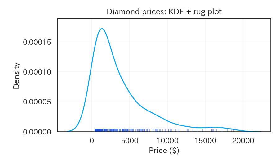
Adding rugplot on top of a histogram or KDE highlights where each observation lies, making the distribution easier to read.

 1
 2
 3
 4
 5
 6
 7
 8
 9
10
11
12
13
14
15
16
17
import seaborn as sns
import matplotlib.pyplot as plt

diamonds = sns.load_dataset("diamonds").sample(300, random_state=0)

fig, ax = plt.subplots(figsize=(6, 3.5))
sns.kdeplot(data=diamonds, x="price", ax=ax, color="#0ea5e9")
sns.rugplot(data=diamonds, x="price", ax=ax, color="#1d4ed8", alpha=0.4)

ax.set_xlabel("Price ($)")
ax.set_ylabel("Density")
ax.set_title("Diamond prices: KDE + rug plot")
ax.grid(alpha=0.2)

fig.tight_layout()

plt.show()

Rug marks show where each individual observation falls.

Reading tips #

  • Dense clusters of short rug marks indicate many observations in that range.
  • Use a light color so the rug does not dominate the KDE.
  • On very large data sets, rug plots can be expensive to draw; consider sampling or reducing the height.
  • Histogram — Show frequency distribution with bins
  • Swarm Plot — Arrange individual data points without overlap
  • Density Plot — Visualize distribution with a smooth curve