6.2.9
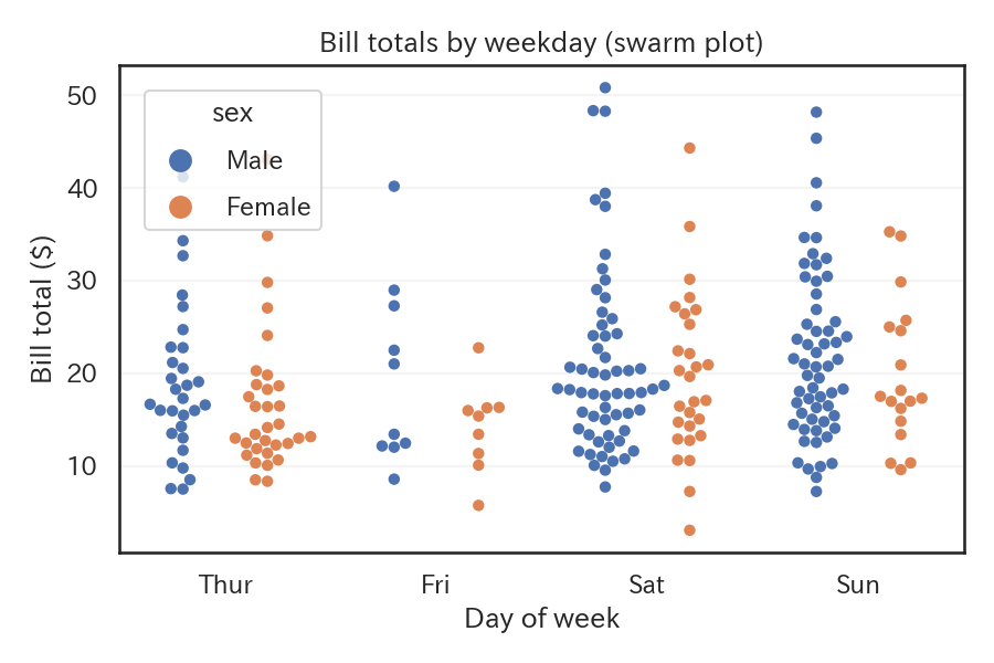
Keep points from overlapping with a swarm plot
A swarm plot offsets each observation to avoid overlap, so you can retain individual values while still seeing the overall shape of the distribution.
| |
Reading tips #
- The vertical extent of each stack corresponds to local density, and outliers remain visible as individual points.
- With very large data sets, swarm plots become heavy to compute, so sampling or adjusting
sizemay be necessary. - Setting
dodge=Trueseparates each hue category into its own column for easier comparisons.
- Violin Plot — Show distribution shape with box plot + KDE
- Box Plot — Compare median, quartiles, and outliers
- Rug Plot — Display individual data points as short lines along the axis