6.2.4
Violin plot
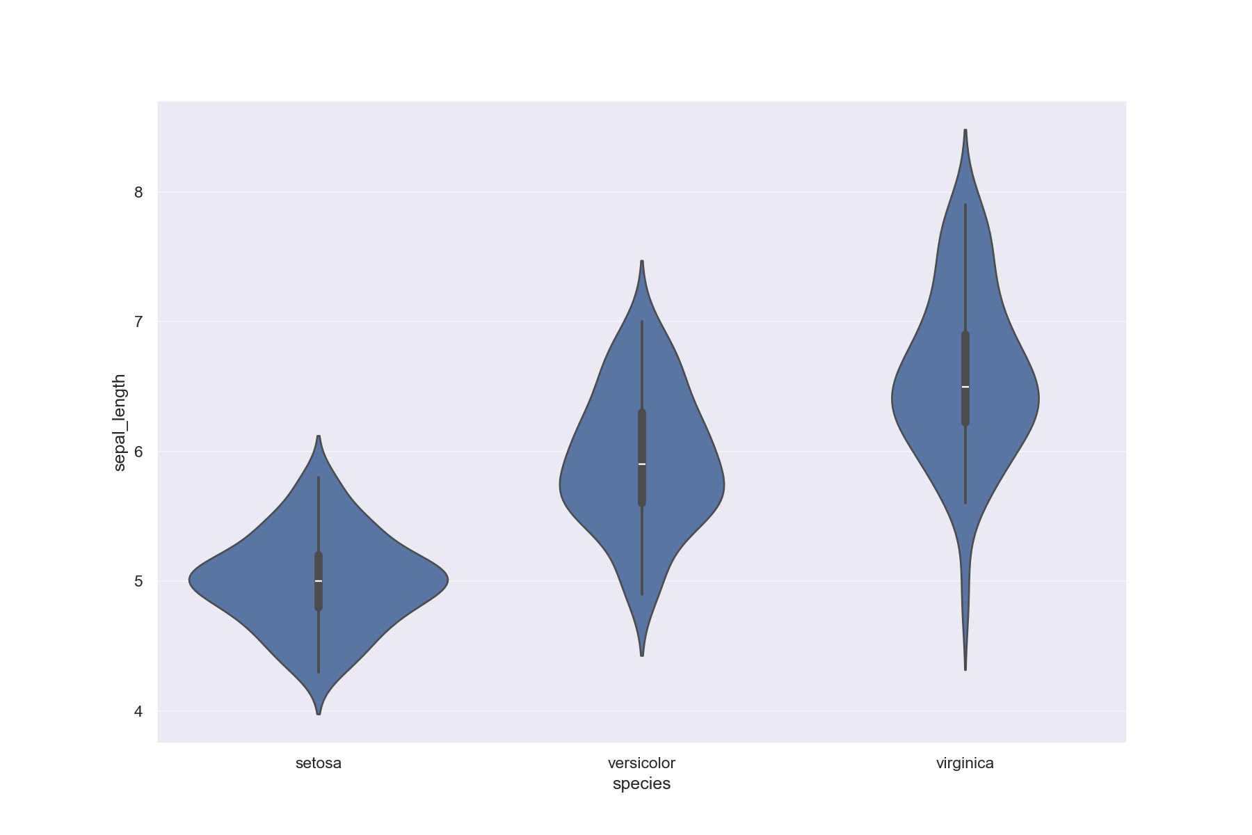
Violin plot is a box-and-whisker diagram with a density graph rotated 90 degrees on each side. Violin plot allows comparison of the distribution of values for several groups.
| |
- Box Plot — Compare median, quartiles, and outliers
- Swarm Plot — Arrange individual data points without overlap
- Ridgeline Plot — Compare distributions by category with overlapping ridges