4.2.1
Coeficiente de correlación Resumen Coeficiente de correlaciónの概要を押さえ、評価対象と読み取り方を整理します。 Python 3.13 のコード例で算出・可視化し、手順と実務での確認ポイントを確認します。 図表や補助指標を組み合わせ、モデル比較や閾値調整に活かすヒントをまとめます。 El coeficiente de correlación mide la fuerza de una relación lineal entre dos datos o variables aleatorias.
Es un indicador que permite comprobar si existe un cambio de tendencia de forma lineal entre dos variables, que puede expresarse en la siguiente ecuación.
$
\frac{\Sigma_{i=1}^N (x_i - \bar{x})(y_i - \bar{y})}{\sqrt{\Sigma_{i=1}^N(x_i - \bar{x})^2 \Sigma_{i=1}^N(y_i - \bar{y})^2 }}
$
Tiene las siguientes propiedades
-1 a menos o igual que 1.
Si el coeficiente de correlación se acerca a 1, \(x\) aumenta → \(y\) también aumenta
El valor del coeficiente de correlación no cambia cuando \(x, y\) se multiplican por un número bajo
Calcular el coeficiente de correlación entre dos columnas numéricas
# 1
2
3
import numpy as np
np . random . seed ( 777 ) # para fijar números aleatorios
1
2
3
4
5
6
7
8
9
10
11
12
13
14
15
16
17
import matplotlib.pyplot as plt
import numpy as np
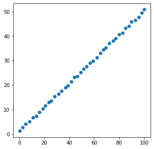
x = [ xi + np . random . rand () for xi in np . linspace ( 0 , 100 , 40 )]
y = [ yi + np . random . rand () for yi in np . linspace ( 1 , 50 , 40 )]
plt . figure ( figsize = ( 5 , 5 ))
plt . scatter ( x , y )
plt . show ()
coef = np . corrcoef ( x , y )
print ( coef )
[[1. 0.99979848]
[0.99979848 1. ]]
Calcular colectivamente el coeficiente de correlación entre múltiples variables
# 1
2
3
4
5
import seaborn as sns
df = sns . load_dataset ( "iris" )
df . head ()
<tr style="text-align: right;">
<th></th>
<th>sepal_length</th>
<th>sepal_width</th>
<th>petal_length</th>
<th>petal_width</th>
<th>species</th>
</tr>
<tr>
<th>0</th>
<td>5.1</td>
<td>3.5</td>
<td>1.4</td>
<td>0.2</td>
<td>setosa</td>
</tr>
<tr>
<th>1</th>
<td>4.9</td>
<td>3.0</td>
<td>1.4</td>
<td>0.2</td>
<td>setosa</td>
</tr>
<tr>
<th>2</th>
<td>4.7</td>
<td>3.2</td>
<td>1.3</td>
<td>0.2</td>
<td>setosa</td>
</tr>
<tr>
<th>3</th>
<td>4.6</td>
<td>3.1</td>
<td>1.5</td>
<td>0.2</td>
<td>setosa</td>
</tr>
<tr>
<th>4</th>
<td>5.0</td>
<td>3.6</td>
<td>1.4</td>
<td>0.2</td>
<td>setosa</td>
</tr>
Comprobar las COEFICIENCIAS DE CORRELACIÓN entre todas las variables
# Utilizando el conjunto de datos del iris, veamos la correlación entre las variables.
1
df . corr () . style . background_gradient ( cmap = "YlOrRd" )
<tr>
<th class="blank level0" > </th>
<th class="col_heading level0 col0" >sepal_length</th>
<th class="col_heading level0 col1" >sepal_width</th>
<th class="col_heading level0 col2" >petal_length</th>
<th class="col_heading level0 col3" >petal_width</th>
</tr>
<tr>
<th id="T_dbd76_level0_row0" class="row_heading level0 row0" >sepal_length</th>
<td id="T_dbd76_row0_col0" class="data row0 col0" >1.000000</td>
<td id="T_dbd76_row0_col1" class="data row0 col1" >-0.117570</td>
<td id="T_dbd76_row0_col2" class="data row0 col2" >0.871754</td>
<td id="T_dbd76_row0_col3" class="data row0 col3" >0.817941</td>
</tr>
<tr>
<th id="T_dbd76_level0_row1" class="row_heading level0 row1" >sepal_width</th>
<td id="T_dbd76_row1_col0" class="data row1 col0" >-0.117570</td>
<td id="T_dbd76_row1_col1" class="data row1 col1" >1.000000</td>
<td id="T_dbd76_row1_col2" class="data row1 col2" >-0.428440</td>
<td id="T_dbd76_row1_col3" class="data row1 col3" >-0.366126</td>
</tr>
<tr>
<th id="T_dbd76_level0_row2" class="row_heading level0 row2" >petal_length</th>
<td id="T_dbd76_row2_col0" class="data row2 col0" >0.871754</td>
<td id="T_dbd76_row2_col1" class="data row2 col1" >-0.428440</td>
<td id="T_dbd76_row2_col2" class="data row2 col2" >1.000000</td>
<td id="T_dbd76_row2_col3" class="data row2 col3" >0.962865</td>
</tr>
<tr>
<th id="T_dbd76_level0_row3" class="row_heading level0 row3" >petal_width</th>
<td id="T_dbd76_row3_col0" class="data row3 col0" >0.817941</td>
<td id="T_dbd76_row3_col1" class="data row3 col1" >-0.366126</td>
<td id="T_dbd76_row3_col2" class="data row3 col2" >0.962865</td>
<td id="T_dbd76_row3_col3" class="data row3 col3" >1.000000</td>
</tr>
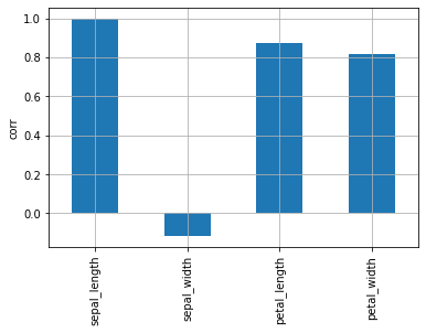
En el mapa de calor, es difícil ver dónde es mayor la correlación. Compruebe el gráfico de barras para ver qué variables tienen la mayor correlación con longitud_de_sepal.
1
df . corr ()[ "sepal_length" ] . plot . bar ( grid = True , ylabel = "corr" )
Cuando el coeficiente de correlación es bajo
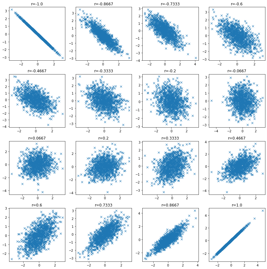
# Compruebe la distribución de los datos cuando el coeficiente de correlación es bajo y confirme que el coeficiente de correlación puede ser bajo incluso cuando existe una relación entre las variables.
 1
 2
 3
 4
 5
 6
 7
 8
 9
10
11
12
13
14
15
16
17
18
19
20
21
22
23
n_samples = 1000
plt . figure ( figsize = ( 12 , 12 ))
for i , ci in enumerate ( np . linspace ( - 1 , 1 , 16 )):
ci = np . round ( ci , 4 )
mean = np . array ([ 0 , 0 ])
cov = np . array ([[ 1 , ci ], [ ci , 1 ]])
v1 , v2 = np . random . multivariate_normal ( mean , cov , size = n_samples ) . T
plt . subplot ( 4 , 4 , i + 1 )
plt . plot ( v1 , v2 , "x" )
plt . title ( f "r= { ci } " )
plt . tight_layout ()
plt . show ()
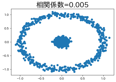
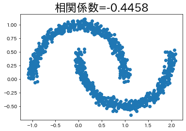
En algunos casos, existe una relación entre las variables aunque el coeficiente de correlación sea bajo.
Intentaremos crear un ejemplo de este tipo, aunque sea sencillo.
1
2
3
4
5
6
7
8
9
10
11
12
13
14
15
16
17
18
19
20
21
22
23
24
25
26
27
import japanize_matplotlib
from sklearn import datasets
japanize_matplotlib . japanize ()
n_samples = 1000
circle , _ = datasets . make_circles ( n_samples = n_samples , factor = 0.1 , noise = 0.05 )
moon , _ = datasets . make_moons ( n_samples = n_samples , noise = 0.05 )
corr_circle = np . round ( np . corrcoef ( circle [:, 0 ], circle [:, 1 ])[ 1 , 0 ], 4 )
plt . title ( f "correlation coefficient= { corr_circle } " , fontsize = 23 )
plt . scatter ( circle [:, 0 ], circle [:, 1 ])
plt . show ()
corr_moon = np . round ( np . corrcoef ( moon [:, 0 ], moon [:, 1 ])[ 1 , 0 ], 4 )
plt . title ( f "correlation coefficient= { corr_moon } " , fontsize = 23 )
plt . scatter ( moon [:, 0 ], moon [:, 1 ])
plt . show ()