4.3.3
ROC-AUC
まとめ
- ROC-AUC は閾値に依存せず分類器の識別性能を測る面積指標です。
- ロジスティック回帰で ROC 曲線と AUC を描き、ランダム分類との違いを確認します。
- 閾値設計やコスト調整に活かす際の読み方と注意点を整理します。
- 感度と特異度 の概念を先に学ぶと理解がスムーズです
1. ROC 曲線と AUC の定義 #
ROC 曲線は False Positive Rate (FPR) を横軸、True Positive Rate (TPR) を縦軸に取った曲線で、分類器の閾値を 0〜1 の範囲で動かして得られます。AUC(Area Under the Curve)はこの曲線の面積を 0〜1 の数値で表します。
- AUC = 1.0: 完全に識別できている理想状態
- AUC = 0.5: 完全なランダム予測(対角線上)
- AUC < 0.5: 予測が逆向きの可能性があり、確率を反転すると改善余地がある
flowchart LR
A["分類器の\nスコア出力"] --> B["閾値θを\n0→1に変化"]
B --> C["各θで\nFPR,TPRを計算"]
C --> D["ROC曲線を描画\nFPR軸×TPR軸"]
D --> E["曲線下面積\nAUCを算出"]
E --> F{"AUC値の解釈"}
F -->|"≈ 1.0"| G["完全識別"]
F -->|"≈ 0.5"| H["ランダム予測"]
style A fill:#2563eb,color:#fff
style E fill:#1e40af,color:#fff
style G fill:#10b981,color:#fff
style H fill:#ef4444,color:#fff
2. Python 3.13 での実装と可視化 #
まずは環境を確認し、必要なライブラリを導入します。
| |
乳がん診断データセットにロジスティック回帰を適用し、ROC 曲線と AUC を描画します。図表は static/images/eval/classification/rocauc に保存され、generate_eval_assets.py から再利用できます。
| |
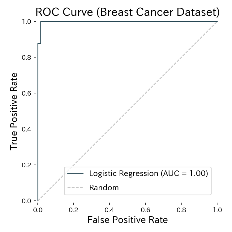
ROC 曲線の面積(AUC)がモデルの判別性能を表す
閾値と ROC 曲線 #
スライダーを動かして、閾値の変化に応じた TPR と FPR の推移を確認してください。
3. 閾値調整で確認したいこと #
- Recall を重視するケース: 医療や不正検知など見逃しのコストが大きい場合、ROC 曲線で TPR を高く保ちながら許容できる FPR を探る。
- 精度と再現率のバランス: AUC が高いモデルほど、閾値 0.5 以外でも性能が安定しやすい。
- 複数モデルの比較: AUC が高いほど全体的な判別能力が高いと期待できるが、差が小さいときは PR-AUC や業務指標も併用する。
閾値を変更すると Precision-Recall のバランスも変わるため、ROC-AUC と PR-AUC を合わせて確認すると意思決定がしやすくなります。
多クラス分類ではAUCの計算方法に注意が必要です。scikit-learnの roc_auc_score はデフォルトでOvR(One-vs-Rest)の平均AUCを返しますが、クラス間の識別性能に大きな差がある場合は各クラスのAUCを個別に確認してください。
4. 実運用でのチェックリスト #
- データが大きく偏っていないか: AUC が 0.5 付近でも別の閾値で救える可能性がある。
- クラス重みやサンプルウェイトの影響: 重みを調整して AUC が改善するか確認する。
- ダッシュボード化の検討: 閾値を調整しやすいよう、ROC 曲線を共有して意思決定を支援する。
- Python 3.13 ノートブックで再現可能に: モデル更新時にも同じ手順で計算・比較できるようにする。
クラス不均衡が強い場合(例: 陽性率5%未満)はROC-AUCに加えてPR-AUC(Precision-Recall曲線の面積)も確認してください。ROC-AUCは不均衡データで見かけ上良いスコアが出やすいですが、PR-AUCは少数クラスへの性能を直接反映します。
まとめ #
- ROC-AUC は閾値を横断的に評価できる指標で、0.5〜1.0 の範囲で判別性能を把握できる。
- Python 3.13 + scikit-learn では
RocCurveDisplayとroc_auc_scoreを組み合わせると簡潔に可視化と評価が可能。 - 閾値チューニングやモデル比較に活用し、Precision-Recall などの指標と併せて総合的に判断しよう。
- 平均適合率 — 不均衡データで有効なPR曲線指標
- 適合率・再現率 — 閾値ごとのトレードオフ
- 対数損失 — 確率予測の品質評価
- Focal Loss — 不均衡データ向けの損失関数