A treemap is a diagram that can be used to visualize numerical data with hierarchical categories. A typical example is a heat map of the Nikkei 225 or the S&P 500. This notebook uses squarify.
 1
 2
 3
 4
 5
 6
 7
 8
 9
10
11
12
13
14
15
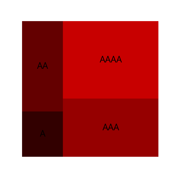
| import numpy as np
import matplotlib.pyplot as plt
import japanize_matplotlib
import squarify
np.random.seed(0) # Fix random numbers
labels = ["A" * i for i in range(1, 5)]
sizes = [i * 10 for i in range(1, 5)]
colors = ["#%02x%02x%02x" % (i * 50, 0, 0) for i in range(1, 5)]
plt.figure(figsize=(5, 5))
squarify.plot(sizes, color=colors, label=labels)
plt.axis("off")
plt.show()
|
Visualisasikan portofolio saya
#
Misalkan saya memiliki data tentang harga perolehan dan harga saat ini untuk setiap saham yang saya miliki.
Dari sana, saya akan membuat heatmap seperti finviz.
Misalkan kita membaca data berikut dari csv.
※Data yang ditampilkan di sini adalah fiktif.
 1
 2
 3
 4
 5
 6
 7
 8
 9
10
11
12
13
14
15
16
17
| import pandas as pd
data = [
["PBR", 80.20, 130.00],
["GOOG", 1188.0, 1588.0],
["FLNG", 70.90, 230.00],
["ZIM", 400.22, 630.10],
["GOGL", 120.20, 90.90],
["3466\nラサールロジ", 156.20, 147.00], # 日本語表示のテスト用
]
df = pd.DataFrame(data)
df.columns = ["銘柄名", "取得価額", "現在の価額"]
df["評価損益"] = df["現在の価額"] - df["取得価額"]
df.head(6)
plt.show()
|
| 銘柄名 | 取得価額 | 現在の価額 | 評価損益 |
|---|
| 0 | PBR | 80.20 | 130.0 | 49.80 |
|---|
| 1 | GOOG | 1188.00 | 1588.0 | 400.00 |
|---|
| 2 | FLNG | 70.90 | 230.0 | 159.10 |
|---|
| 3 | ZIM | 400.22 | 630.1 | 229.88 |
|---|
| 4 | GOGL | 120.20 | 90.9 | -29.30 |
|---|
| 5 | 3466\nラサールロジ | 156.20 | 147.0 | -9.20 |
|---|
Tentukan warna treemap
#
Hijau untuk area yang menguntungkan dan merah untuk area yang merugi.
 1
 2
 3
 4
 5
 6
 7
 8
 9
10
11
12
13
14
15
16
17
18
19
20
21
| colors = []
percents = []
for p_or_l, oac in zip(df["評価損益"], df["取得価額"]):
percent = p_or_l / oac * 100
if p_or_l > 0:
g = np.min([percent * 255 / 100 + 100, 255.0])
color = "#%02x%02x%02x" % (0, int(g), 0)
colors.append(color)
else:
r = np.min([-percent * 255 / 100 + 100, 255])
color = "#%02x%02x%02x" % (int(r), 0, 0)
colors.append(color)
percents.append(percent)
print(df["銘柄名"].values)
print(colors)
print(percents)
plt.show()
|
['PBR' 'GOOG' 'FLNG' 'ZIM' 'GOGL' '3466\nラサールロジ']
['#00ff00', '#00b900', '#00ff00', '#00f600', '#a20000', '#730000']
[62.094763092269325, 33.670033670033675, 224.4005641748942, 57.43840887511868, -24.376039933444257, -5.8898847631241935]
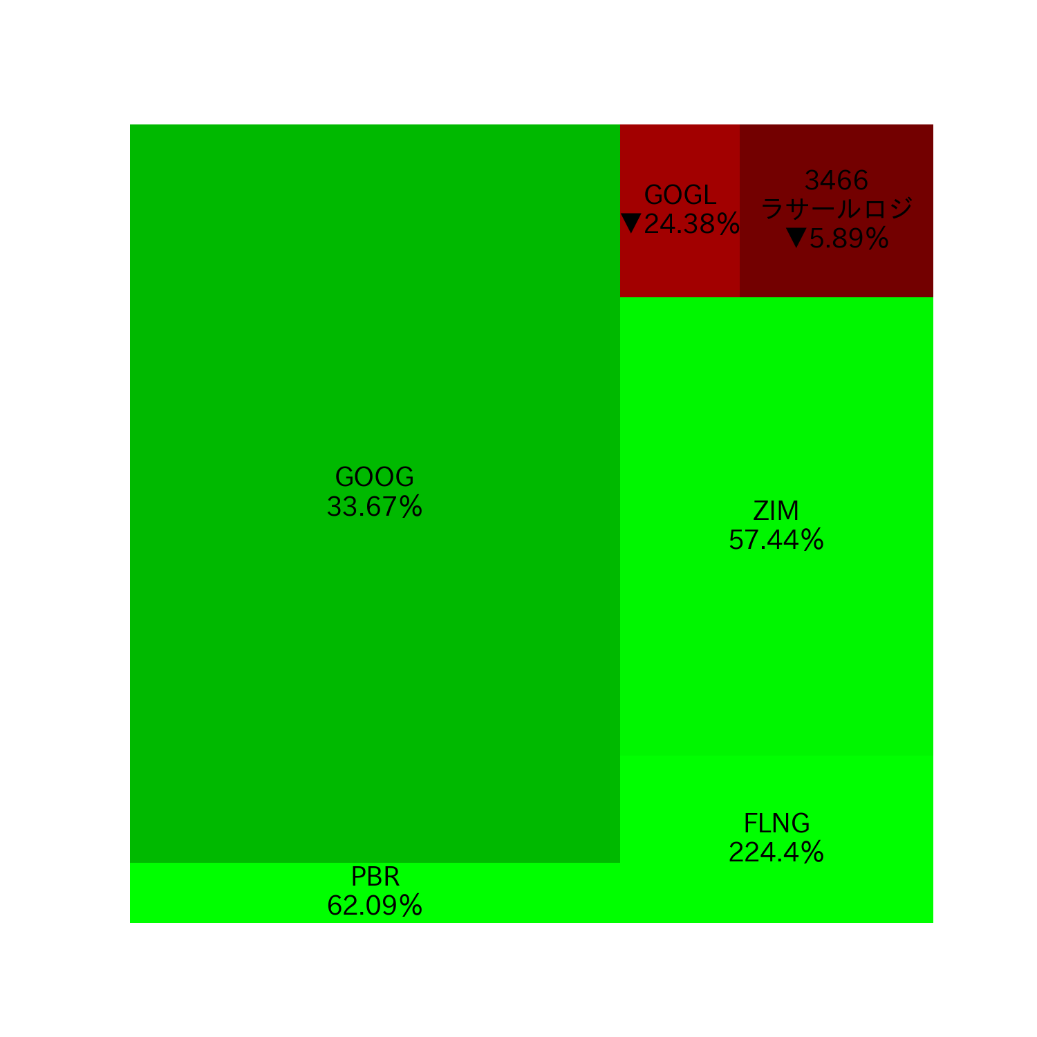
Menampilkan treemap
#
Mari kita tampilkan keuntungan/kerugian dalam warna dan persentase keuntungan/kerugian pada treemap.
Karakter Jepang tidak kacau karena import japanize_matplotlib digunakan di awal.
 1
 2
 3
 4
 5
 6
 7
 8
 9
10
11
| current_prices = [cp for cp in df["現在の価額"]]
labels = [
f"{name}\n{np.round(percent, 2)}%".replace("-", "▼")
for name, percent in zip(df["銘柄名"], percents)
]
plt.figure(figsize=(10, 10))
plt.rcParams["font.size"] = 18
squarify.plot(current_prices, color=colors, label=labels)
plt.axis("off")
plt.show()
|
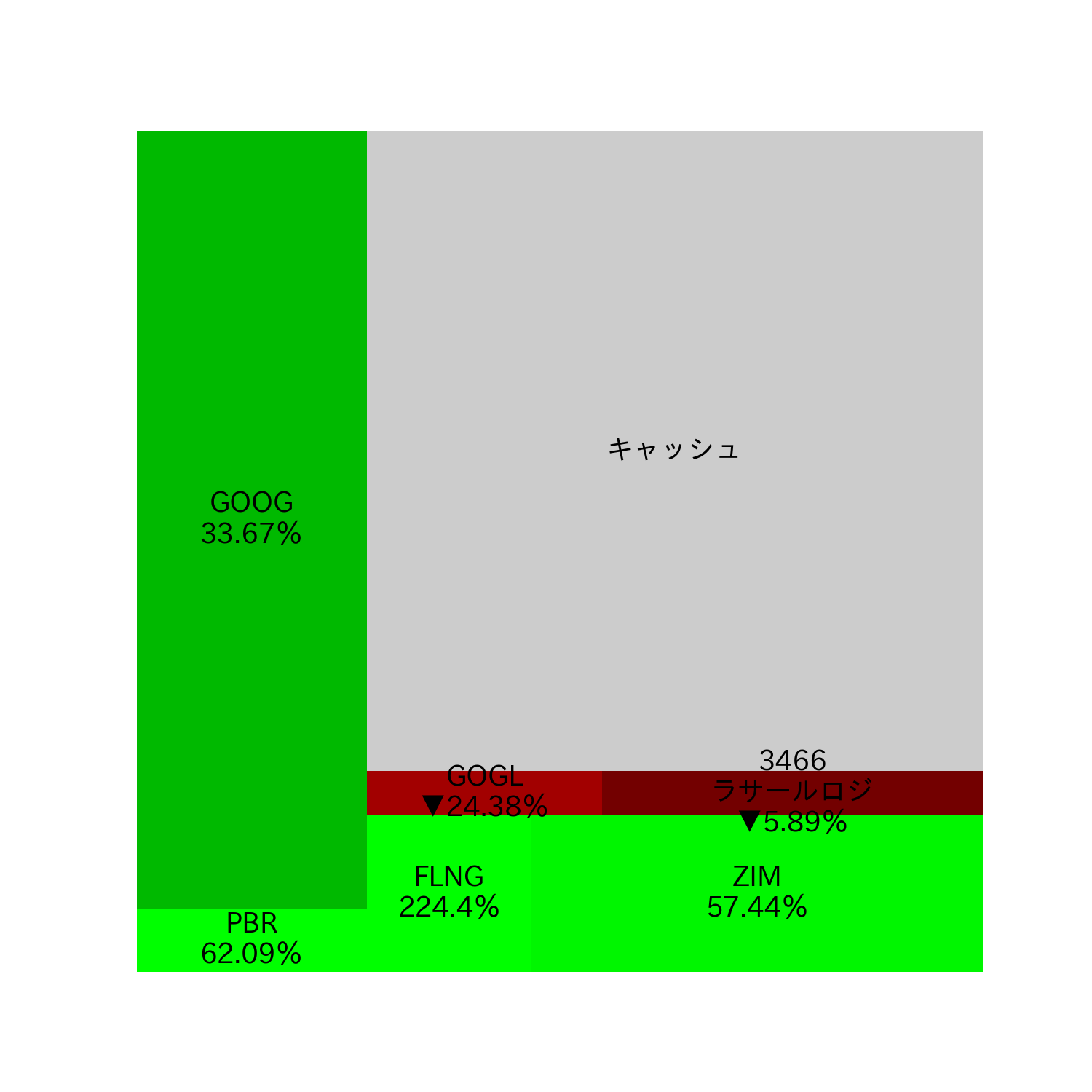
Tambahkan tampilan cache ke treemap
#
Mari kita juga menambahkan tampilan cache ke treemap. Warnanya harus abu-abu.
1
2
3
4
5
6
7
| plt.figure(figsize=(10, 10))
plt.rcParams["font.size"] = 18
squarify.plot(
current_prices + [3500], color=colors + ["#ccc"], label=labels + ["キャッシュ"]
)
plt.axis("off")
plt.show()
|