サンキーダイアグラム
サンキーダイアグラムはステップ間の流量を表現する図表であり、金額や資源の割り当てがどのように変化しているかを可視化するのに活用することができます。線の太さが割り当てられた流れの量を示しています。このページではplotlyを使ってpython上でサンキーダイアグラムを作成します。
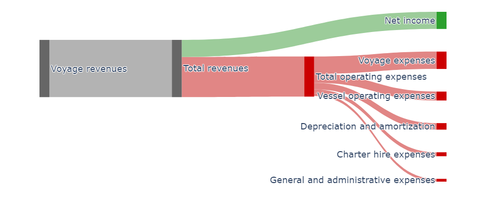
以下は『Genco Shipping & Trading Limited』のある期の損益を可視化してみたものであり、最新のデータではないので注意してください。
import plotly.graph_objects as go

fig = go.Figure(
    data=[
        go.Sankey(
            node=dict(
                pad=300,
                thickness=20,
                line=dict(color="white", width=0.0),
                label=[
                    "Voyage revenues",
                    "Total revenues",
                    "Total operating expenses",
                    "Net income",
                    "Voyage expenses",
                    "Vessel operating expenses",
                    "Charter hire expenses",
                    "General and administrative expenses",
                    "Depreciation and amortization",
                ],
                color=[
                    "#666666",
                    "#666666",
                    "#CC0001",
                    "#2BA02D",
                    "#CC0001",
                    "#CC0001",
                    "#CC0001",
                    "#CC0001",
                    "#CC0001",
                ],
            ),
            link=dict(
                source=[0, 1, 1, 2, 2, 2, 2, 2],
                target=[1, 2, 3, 4, 5, 6, 7, 8],
                value=[121008, 84759, 36249, 36702, 18789, 8325, 5854, 13769],
                color=[
                    "#B3B3B3",
                    "#E18685",
                    "#9CCC9A",
                    "#E18685",
                    "#E18685",
                    "#E18685",
                    "#E18685",
                    "#E18685",
                ],
            ),
        )
    ]
)

fig.update_layout(
    title_text="Condensed Consolidated Statements of Operations", font_size=18
)
fig.show()