matplotlibスタイルシート
matplotlibで毎回グラフの文字サイズなどを調整するのは面倒な場合、スタイルシートにてデフォルトの色や文字サイズを指定するという方法があります。このページでは指定したスタイルシートを読み込み、その表示をたしかめてみます。
以下の例では、”k_dm.mplstyle”でcoolorsのパレットから色を選びグラフ作成時にその色を使用するように指定しています。 また、散布図などのマーカーのサイズ・ラベルの文字サイズ・凡例(legend)の文字サイズ・グリッド線の表示方法などもスタイルシートで指定しています。
デフォルトで読み込まれるスタイルシートのファイルを確認する
matplotlibがデフォルトで読み込むスタイルシートを確認します。コマンドライン上で python -c "import matplotlib;print(matplotlib.matplotlib_fname())" と実行することで確認ができます。
python -c "import matplotlib;print(matplotlib.matplotlib_fname())"
C:\Users\xxx\env-py3.10\.venv\lib\site-packages\matplotlib\mpl-data\matplotlibrc
このファイルを直接書き換えるか、以下に示すように plt.style.use("k_dm.mplstyle") として指定したファイルを読み込むことによって、スタイルシートを変更できます。
自作したスタイルシートを読み込む
以下では、自作したスタイルシート(k_dm.mplstyle)の表示を確認してみます。使用したスタイルシートの詳細な指定を知りたい方はgithub上で確認してください。
import numpy as np
import matplotlib.pyplot as plt
from sklearn.datasets import load_iris
import japanize_matplotlib

plt.style.use("k_dm.mplstyle")  # ここで自作したスタイルシートを読み込んでいます
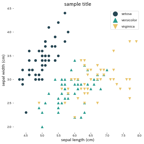
散布図
Xy = load_iris(as_frame=True)
X = Xy["data"].values
y = Xy["target"].values

markers = ["o", "^", "v"]
featname_1 = "sepal length (cm)"
featname_2 = "sepal width (cm)"

fig, ax = plt.subplots(figsize=(8, 8))
for i in range(3):
    plt.scatter(X[y == i, 0], X[y == i, 1], marker=markers[i])
plt.xlabel(featname_1)
plt.ylabel(featname_2)
plt.legend(Xy.target_names)
plt.title("sample title")
plt.show()
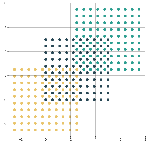
fig, ax = plt.subplots(figsize=(8, 8))
X, Y = np.meshgrid(np.linspace(0.0, 5.0, 10), np.linspace(0.0, 5.0, 10))
x, y = X.ravel(), Y.ravel()
ax.scatter(x, y, label="A")
ax.scatter(x + 2.5, y + 2.5, label="B")
ax.scatter(x - 2.5, y - 2.5, label="C")
plt.grid()
plt.show()
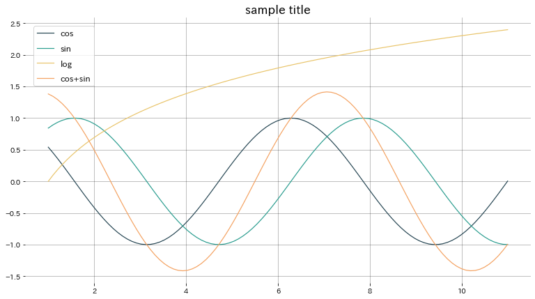
プロット
plt.figure(figsize=(13, 7))
x = np.linspace(0, 10, 100) + 1.0
plt.plot(x, np.cos(x), label="cos")
plt.plot(x, np.sin(x), label="sin")
plt.plot(x, np.log(x), label="log")
plt.plot(x, np.cos(x) + np.sin(x), label="cos+sin")
plt.legend()
plt.title("sample title")
plt.grid()
plt.show()
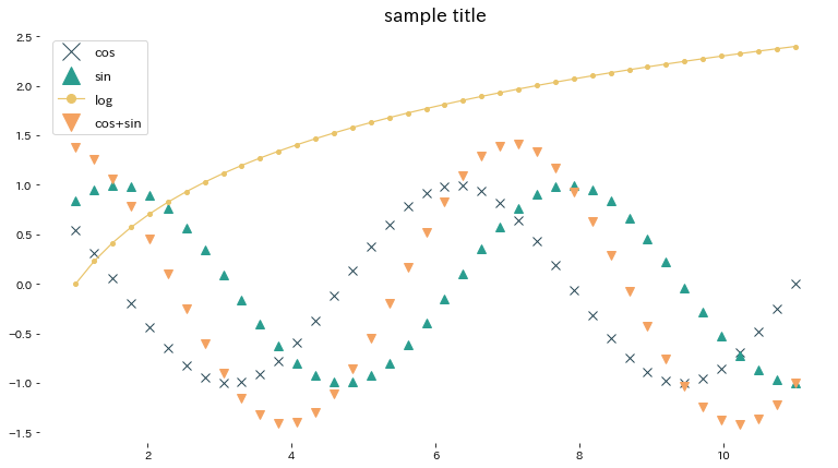
plt.figure(figsize=(13, 7))
x = np.linspace(0, 10, 40) + 1.0
plt.plot(x, np.cos(x), "x", label="cos")
plt.plot(x, np.sin(x), "^", label="sin")
plt.plot(x, np.log(x), ".-", label="log")
plt.plot(x, np.cos(x) + np.sin(x), "v", label="cos+sin")
plt.legend()
plt.title("sample title")
plt.show()
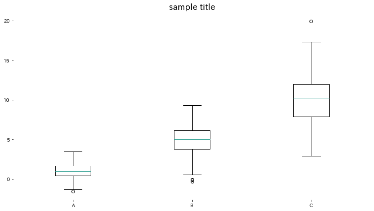
箱髭図
np.random.seed(777)

x1 = np.random.normal(1, 1, 200)
x2 = np.random.normal(5, 2, 200)
x3 = np.random.normal(10, 3, 200)

fig = plt.figure(figsize=(13, 7))
ax = fig.add_subplot(1, 1, 1)
ax.boxplot([x1, x2, x3], labels=["A", "B", "C"])
plt.title("sample title")
plt.show()
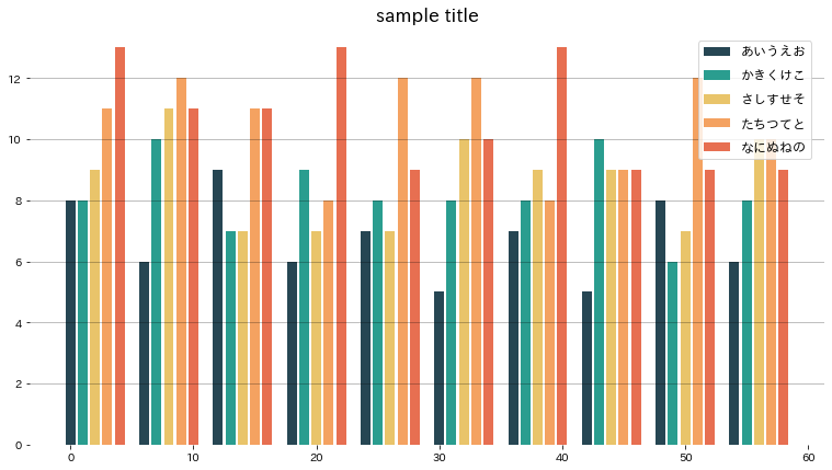
棒グラフ
np.random.seed(777)

fig = plt.figure(figsize=(13, 7))
indexes = np.array([i for i in range(10)]) * 6
for i, label in enumerate(["あいうえお", "かきくけこ", "さしすせそ", "たちつてと", "なにぬねの"]):
    plt.bar(indexes + i, [np.random.randint(5, 10) + i for _ in range(10)], label=label)
plt.legend()
plt.title("sample title")
plt.grid(axis="y")
plt.show()
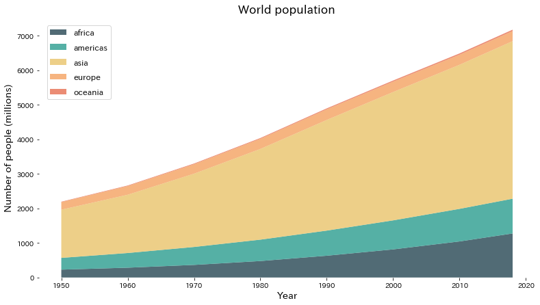
stackplot
matplotlibのギャラリーよりStackplots コードを引用しています。
year = [1950, 1960, 1970, 1980, 1990, 2000, 2010, 2018]
population_by_continent = {
    "africa": [228, 284, 365, 477, 631, 814, 1044, 1275],
    "americas": [340, 425, 519, 619, 727, 840, 943, 1006],
    "asia": [1394, 1686, 2120, 2625, 3202, 3714, 4169, 4560],
    "europe": [220, 253, 276, 295, 310, 303, 294, 293],
    "oceania": [12, 15, 19, 22, 26, 31, 36, 39],
}

fig, ax = plt.subplots(figsize=(13, 7))
ax.stackplot(
    year,
    population_by_continent.values(),
    labels=population_by_continent.keys(),
    alpha=0.8,
)
ax.legend(loc="upper left")
ax.set_title("World population")
ax.set_xlabel("Year")
ax.set_ylabel("Number of people (millions)")

plt.show()