3.3.4
Hotelling の T^2 で異常値にラベルを付ける
まとめ- Hotelling の T^2 統計量を使い、時系列データの異常値を自動でラベリングする。
scipy.stats.chi2 で閾値を算出し、T^2 スコアが閾値を超える点を異常と判定する。- 多変量正規分布を仮定できるデータで、統計的根拠に基づく異常検知を行いたいときに使う。
<p><b>Hotelling の T^2 統計量</b>は、平均ベクトルと共分散を用いたマハラノビス距離です。多変量正規分布を仮定できる特徴量ベクトルであれば、T^2 の上限を \(\chi^2\) 分布から求めて異常点を自動でラベリングできます。</p>
T^2 と (\chi^2) 閾値
#
特徴量ベクトル (x \in \mathbb{R}^d)、平均 (\mu)、共分散 (\Sigma) に対し、
$$
T^2 = (x - \mu)^\top \Sigma^{-1} (x - \mu)
$$を計算します。多変量正規を仮定すると (T^2) は自由度 (d) の (\chi^2_d) に従うため、検出閾値 (\tau) は
$$
\tau = \chi^2_d(1 - \alpha)
$$で与えられます。(T^2 > \tau) となる観測は異常と判定できます。1 次元では二乗した z スコアと一致します。
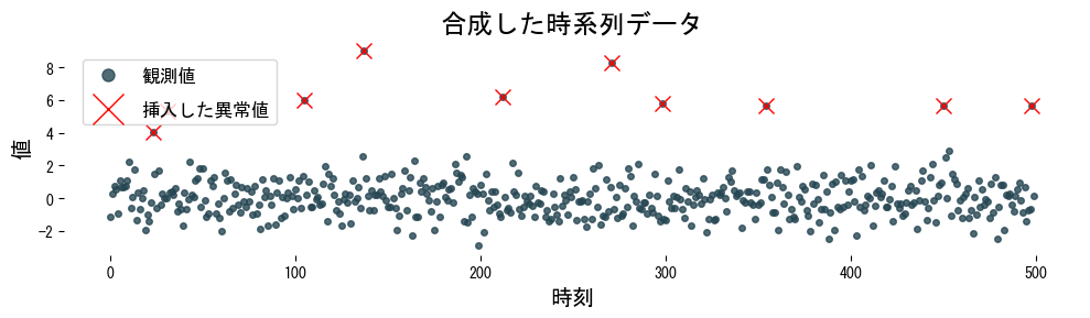
サンプルデータを作成する
#
 1
 2
 3
 4
 5
 6
 7
 8
 9
10
11
12
13
14
15
16
17
18
19
20
| import numpy as np
import matplotlib.pyplot as plt
rng = np.random.default_rng(100)
n_samples = 500
time = np.arange(n_samples)
series = rng.normal(loc=0.0, scale=1.0, size=n_samples)
anomaly_index = rng.choice(n_samples, size=10, replace=False)
series[anomaly_index] += rng.normal(loc=6.0, scale=1.0, size=anomaly_index.size)
plt.figure(figsize=(10, 3))
plt.plot(time, series, ".", alpha=0.8, label="観測値")
plt.plot(anomaly_index, series[anomaly_index], "x", ms=10, c="red", label="挿入した異常値")
plt.title("合成した時系列データ")
plt.xlabel("時刻")
plt.ylabel("値")
plt.legend()
plt.tight_layout()
plt.show()
|
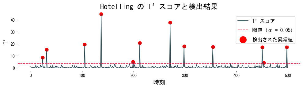
T^2 を計算してラベル付けする
#
 1
 2
 3
 4
 5
 6
 7
 8
 9
10
11
12
13
14
15
16
17
18
19
20
21
22
23
| from scipy.stats import chi2
def detect_hotelling_t2(series: np.ndarray, alpha: float = 0.05) -> tuple[np.ndarray, np.ndarray, float]:
series = np.asarray(series)
mean = series.mean()
var = series.var(ddof=1)
t2_scores = ((series - mean) ** 2) / var
threshold = chi2.ppf(1 - alpha, df=1)
detections = np.where(t2_scores > threshold)[0]
return detections, t2_scores, threshold
detected_index, t2_scores, threshold = detect_hotelling_t2(series, alpha=0.05)
plt.figure(figsize=(10, 3))
plt.plot(time, t2_scores, label="T^2 スコア")
plt.axhline(threshold, color="crimson", linestyle="--", label=f"閾値 (α = 0.05)")
plt.scatter(detected_index, t2_scores[detected_index], c="red", marker="o", s=60, label="検出された異常値")
plt.xlabel("時刻")
plt.ylabel("T^2")
plt.title("Hotelling の T^2 スコアと検出結果")
plt.legend()
plt.tight_layout()
plt.show()
|
実務でのヒント
#
- 次元が高い場合は共分散行列 (\Sigma) の逆行列を直接計算せず、
scipy.linalg.solve で連立方程式として解くと数値的に安定します。 - 閾値 (\alpha) は検出したい異常率に合わせて調整します。アラートを減らしたい監視用途では 0.01 など小さい値から試すのが一般的です。
- 正規性が崩れるデータでは、先にロバストなスケーリングや Box-Cox/Yeo-Johnson 変換を挟むと誤検知が減ります。
- オンライン監視では平均と共分散を定期的に再計算し、データドリフトに追随できるようにしてください。