まとめ- 連続値の特徴量を等幅・等頻度のビンに分割してカテゴリ化する。
pandas.cut(等幅ビン)と pandas.qcut(等頻度ビン)を使って離散化を行う。- 線形モデルに非線形効果を持たせたいときや、所得五分位のような説明力の高い区分を作りたいときに使う。
<p><b>ビニング(離散化)</b>は、連続値の特徴量を順序付きカテゴリに変換する操作です。数値をそのまま扱えないモデルや、「所得の五分位」のような説明力の高い区分を作りたいときに有効です。</p>
等幅ビンと等頻度ビン
#
数値特徴量 (x_1, \dots, x_n) を区間 (I_k) に分割し、各 (x_i) を該当する区間ラベルに置き換えます。
- 等幅ビン(
pandas.cut): 全区間の長さを等しくする。 - 等頻度ビン(
pandas.qcut): 並べ替えたデータを同件数になるよう分割する。
重い裾を持つ分布では等頻度ビンが安定し、距離の概念を保ちたい場合は等幅ビンが向いています。
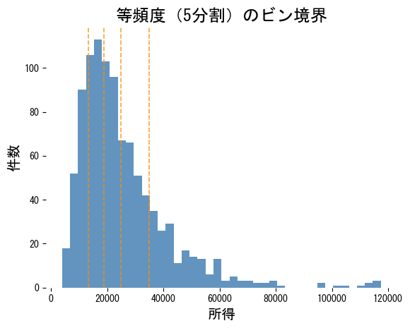
分位ビンを可視化する
#
 1
 2
 3
 4
 5
 6
 7
 8
 9
10
11
12
13
14
15
| import numpy as np
import pandas as pd
import matplotlib.pyplot as plt
rng = np.random.default_rng(18)
income = rng.lognormal(mean=10, sigma=0.55, size=1_000)
quantile_edges = np.quantile(income, np.linspace(0, 1, 6))
plt.hist(income, bins=40, color="steelblue", alpha=0.85)
for edge in quantile_edges[1:-1]:
plt.axvline(edge, color="darkorange", linestyle="--", alpha=0.8)
plt.title("等頻度(5分割)のビン境界")
plt.xlabel("所得")
plt.ylabel("件数")
plt.show()
|
qcut と cut の比較
#
 1
 2
 3
 4
 5
 6
 7
 8
 9
10
11
12
13
14
15
16
17
| quantile_bins = pd.qcut(income, q=5)
width_bins = pd.cut(income, bins=5)
quantile_counts = pd.Series(quantile_bins).value_counts(sort=False)
width_counts = pd.Series(width_bins).value_counts(sort=False)
indices = np.arange(len(quantile_counts))
fig, ax = plt.subplots(figsize=(7, 4))
ax.bar(indices - 0.2, quantile_counts.values, width=0.4, color="seagreen", alpha=0.8, label="qcut(等頻度)")
ax.bar(indices + 0.2, width_counts.values, width=0.4, color="firebrick", alpha=0.6, label="cut(等幅)")
ax.set_xticks(indices)
ax.set_xticklabels([f"ビン {i}" for i in indices])
ax.set_ylabel("サンプル数")
ax.legend()
ax.set_title("ビンごとのサンプル数")
plt.tight_layout()
plt.show()
|
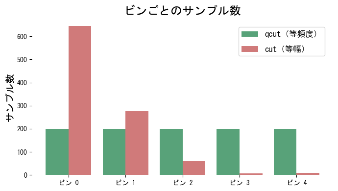
等頻度ビンは各区間で件数がほぼ均等になります。一方、等幅ビンでは中央にサンプルが集中し、裾の区間がスカスカになるのが分かります。
実務でのヒント
#
- 等幅ビンを使う場合は極端な外れ値をあらかじめクリップしないと、ほとんどのビンが空になる恐れがあります。
- 訓練時に得たビン境界は保存し、推論時にも同じ境界を適用することで再現性を保ちます。
- 決定木系モデルではビニングが必須ではありませんが、線形モデルに非線形効果を持たせたいときに有効です。