 1
 2
 3
 4
 5
 6
 7
 8
 9
10
11
12
13
14
15
16
17
18
19
20
21
22
23
24
25
26
27
28
29
30
31
32
33
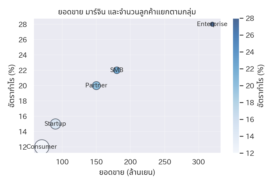
| import numpy as np
import matplotlib.pyplot as plt
segments = ["Enterprise", "SMB", "Startup", "Consumer", "Partner"]
revenue = np.array([320, 180, 90, 70, 150])
margin = np.array([28, 22, 15, 12, 20])
customers = np.array([45, 110, 260, 520, 160])
fig, ax = plt.subplots(figsize=(6, 4))
scatter = ax.scatter(
revenue,
margin,
s=customers,
c=margin,
cmap="Blues",
alpha=0.7,
edgecolors="#1f2937",
)
for x, y, label in zip(revenue, margin, segments):
ax.text(x, y, label, fontsize=10, ha="center", va="center")
ax.set_xlabel("ยอดขาย (ล้านเยน)")
ax.set_ylabel("อัตรากำไร (%)")
ax.set_title("ยอดขาย มาร์จิน และจำนวนลูกค้าแยกตามกลุ่ม")
ax.grid(alpha=0.3)
cbar = fig.colorbar(scatter, ax=ax)
cbar.set_label("อัตรากำไร (%)")
fig.tight_layout()
plt.show()
|