6.5.5
สแคตเตอร์พร้อมฮิสโตแกรมรอบข้าง
seaborn.JointGrid ช่วยให้เราผสมสแคตเตอร์กลางภาพกับฮิสโตแกรมด้านบนและด้านขวาได้อิสระ เหมาะเมื่ออยากดูทั้งความสัมพันธ์และการกระจายของแต่ละแกนในคราวเดียว
 1
 2
 3
 4
 5
 6
 7
 8
 9
10
11
12
13
14
15
16
17
| import seaborn as sns
import matplotlib.pyplot as plt
iris = sns.load_dataset("iris")
g = sns.JointGrid(
data=iris,
x="petal_length",
y="petal_width",
height=4.5,
)
g.plot_joint(sns.scatterplot, hue=iris["species"], palette="Set2", alpha=0.7, s=50)
g.plot_marginals(sns.histplot, element="step", color="#9ca3af", alpha=0.6)
g.fig.suptitle("การกระจายของความยาว-ความกว้างกลีบดอก", y=1.02)
g.fig.tight_layout()
plt.show()
|
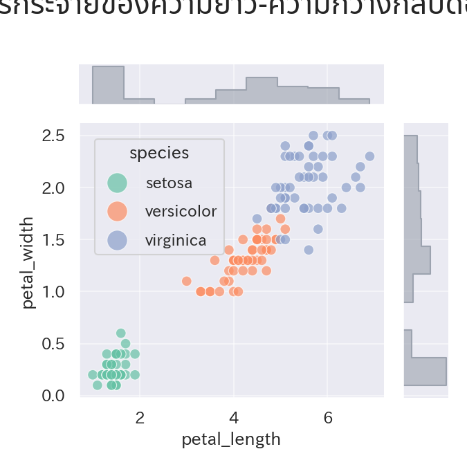
วิธีอ่าน
#
- กราฟกลางบอกความสัมพันธ์ ส่วนฮิสโตแกรมรอบๆ ทำให้เห็นการกระจายของแต่ละแกน
- สามารถเรียก
plot_joint และ plot_marginals ด้วยชนิดกราฟคนละแบบเพื่อออกแบบเลย์เอาต์ตามใจ - เมื่อระบายสีตามสปีชีส์ อย่าลืมเรียก
ax_joint.legend() เพื่อให้คำอธิบายแสดงครบ