バレットチャートで目標達成度を凝縮表示

Visualize

バレットチャートで目標達成度を凝縮表示

作成日: 最終更新: 読了時間: 1 分

KPI をリストで並べつつ目標との差を示したいときは、バレットチャートが省スペースで効果的です。帯の背景に基準領域を敷くことで、達成度のレベルも同時に伝えられます。
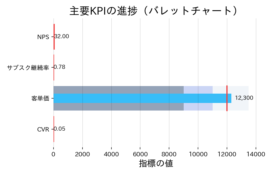
import matplotlib.pyplot as plt
import numpy as np

metrics = ["CVR", "客単価", "サブスク継続率", "NPS"]
actual = np.array([0.046, 12_300, 0.78, 32])
target = np.array([0.05, 12_000, 0.8, 35])
thresholds = np.array(
    [
        [0.02, 0.04, 0.06],
        [9000, 11_000, 13_500],
        [0.6, 0.75, 0.85],
        [10, 25, 40],
    ]
)

fig, ax = plt.subplots(figsize=(6.2, 4))
for idx, name in enumerate(metrics):
    base, good, excellent = thresholds[idx]
    ax.barh(idx, excellent, color="#f1f5f9", height=0.8)
    ax.barh(idx, good, color="#cbd5f5", height=0.8)
    ax.barh(idx, base, color="#94a3b8", height=0.8)
    ax.barh(idx, actual[idx], color="#38bdf8", height=0.3)
    ax.plot(
        [target[idx], target[idx]],
        [idx - 0.4, idx + 0.4],
        color="#ef4444",
        linewidth=2,
    )
    ax.text(
        actual[idx] * 1.02,
        idx,
        f"{actual[idx]:.2f}" if idx != 1 else f"{actual[idx]:,.0f}",
        va="center",
        ha="left",
        fontsize=9,
    )

ax.set_yticks(range(len(metrics)), labels=metrics)
ax.set_xlabel("指標の値")
ax.set_title("主要KPIの進捗(バレットチャート)")
ax.set_xlim(0, max(thresholds[:, -1]) * 1.05)
ax.grid(axis="x", alpha=0.2)
ax.spines[["right", "top"]].set_visible(False)

fig.tight_layout()
fig.savefig("static/images/visualize/advanced/bullet-chart-advanced.svg")

帯の背景に基準領域を敷くことで、達成度のレベルも同時に伝えられますの図

読み方のポイント #

  • 背景の帯は達成レベルを示すゾーンです。濃い部分までバーが伸びていれば上位目標を達成しています。
  • 赤い縦線はターゲット値。バーが右に突き抜けていれば目標超過、届かない場合は未達を示します。
  • 複数指標を1枚に詰め込めるので、週次レポートなどで一覧表示すると省スペースです。