6.7.3
バンプチャートで順位推移を可視化
まとめ
- バンプチャートで期間ごとのランキング推移を折れ線で可視化する。
ax.plotで順位を結び、set_ylimで軸を反転させて上位を上に表示する。- ブランドや商品カテゴリの競争順位変動を追跡したいときに使う。
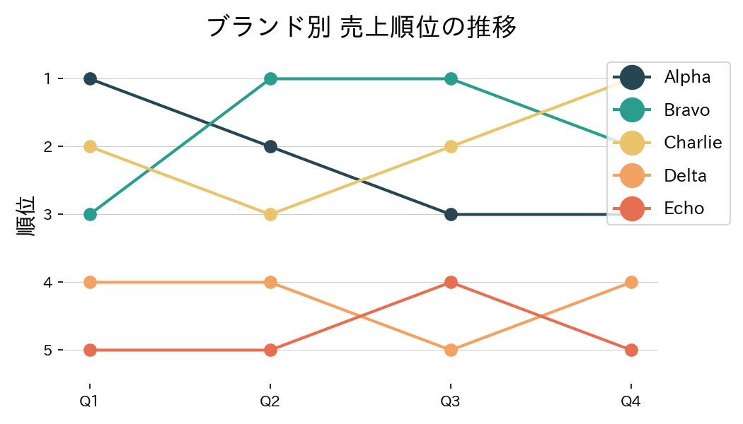
四半期ごとの売上順位を線でつないだバンプチャートです。順位を上下反転して描くのがポイントです。
| |
読み方のポイント #
- 順位は値が小さいほど上位のため、軸を反転させると視覚的に理解しやすい。
- ラインの色やマーカーでブランドを識別し、凡例を右側に配置して重なりを避ける。
- 特定のブランドを強調したい場合は太さや色を変えると効果的。
いつ使うか #
- 適している場面: 時点ごとの順位変動を折れ線で表示したいとき。競合分析やランキング推移の可視化に向いています。
- 不向きな場面: 順位の同率が多い場合、線が重なって判読困難になります。
- 代替手段: 値そのものの推移が重要なら通常の折れ線グラフの方が定量的な比較に適しています。
よくある失敗パターン #
- 順位同率の処理不足: 同率順位がある場合に線が重なって判別不能になります。jitter を加えるか、ラベルで補足してください。
- ラベルの省略: 線の始点や終点にラベルがないと凡例と照合する手間がかかります。線の端にカテゴリ名を直接表示しましょう。
- スロープグラフ — 2時点間の順位変化を線の傾きで表示
- 複数ラインの推移比較 — 複数系列を同一軸で比較
- ダンベルチャート — 2時点の差分を線と点で強調