6.7.4
ダンベルチャートでビフォー・アフター比較
まとめ
- ダンベルチャートで2時点の値を線と点で結び、ビフォー・アフターの差分を強調する。
ax.hlinesで区間を描き、ax.scatterで施策前後の値をプロットする。- 部門別の改善効果やABテスト結果の比較表示に使う。
ダンベルチャートは開始値と終了値を 1 本の線で結び、差分を視覚的に示します。
| |
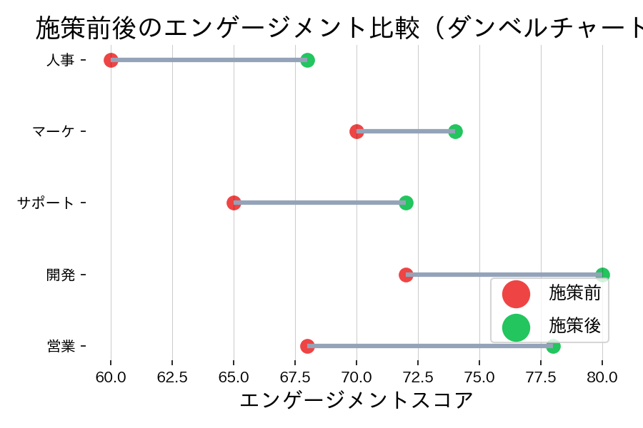
読み方のポイント #
- 線の向きが右に伸びているほど改善、左に伸びているほど悪化を表す。
- 点の色や凡例で時点を区別し、どちらが開始か一目で分かるようにする。
- 差分を数値で表示したい場合はラベルや注釈を追加すると理解が深まる。
いつ使うか #
- 適している場面: 2時点間の変化量やビフォー・アフターの差を視覚的に強調したいとき。
- 不向きな場面: 比較対象が1つ(2時点)でない場合(3時点以上など)は表現が複雑になり読みにくくなります。
- 代替手段: 3時点以上の変化にはスロープグラフやバンプチャートの方が推移を追いやすいです。
よくある失敗パターン #
- 始点と終点の区別不足: 2 つのドットが同じ色・サイズだとどちらが前でどちらが後か分かりません。色や形を変えて明確に区別してください。
- ソートされていない並び: 変化量でソートしないとどの項目の変化が大きいか一目で分かりません。差分の大きい順に並べましょう。