6.7.22
ファネルチャートで段階ごとの離脱を把握
まとめ
- ファネルチャートでステップごとのユーザー離脱を帯幅の減衰で可視化する。
ax.fill_betweenで梯形を描き、各段階の残存数とCVRを表示する。- EC購入フローやサービス登録導線のボトルネック発見に使う。
流入→CVまでの段階ごとの減衰を示すにはファネルチャートが便利です。梯形を使うと帯の幅で残存数の減り具合が直観的に伝わります。
| |
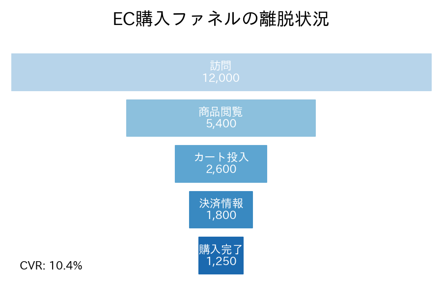
読み方のポイント #
- 各ステップの幅が残存ユーザー数を示します。ギャップが大きい段階がボトルネックです。
- トップとボトムの値からCVRを算出し、図内に表示するとインパクトが伝わります。
- サービスによってステップ名を変えるだけで応用できます。
いつ使うか #
- 適している場面: マーケティングや営業プロセスの段階ごとの離脱率を直感的に示したいとき。
- 不向きな場面: 段階間の時間差やフローの分岐を表現できないため、複雑なプロセスには不十分です。
- 代替手段: 分岐を含むフローにはサンキーダイアグラムの方が柔軟に表現できます。
よくある失敗パターン #
- 段階間の時間差を無視: 各段階のコンバージョン率だけ見て、段階間にかかる時間を無視すると実態と乖離した印象を与えます。時間情報も併記しましょう。
- ファネルの幅が面積と不一致: 幅だけでなく高さも変わると面積が値に比例しなくなります。高さを一定にして幅だけで値を表現してください。
- 積み上げ棒グラフ — 全体量と内訳を同時に表示
- 横向き棒グラフ — ラベルが長い項目を横向きで比較
- サンキーダイアグラム — ステップ間の流量を帯の太さで表現