6.7.9
ホライゾンチャートでシーズン変動を圧縮表示
まとめ
- ホライゾンチャートで時系列の偏差を色帯に折りたたみ、省スペースで変動を表現する。
ax.fill_betweenで正負の偏差を多段の色帯に分割し、振幅を濃淡で示す。- 季節変動が大きいセッション数や売上の周期パターンを限られたスペースで比較したいときに使う。
季節変動が大きい系列を限られたスペースで見せたいときは、帯を折りたたむホライゾンチャートが役立ちます。振幅を色と濃さで表現するため、上下の変化が直感的に把握できます。
| |
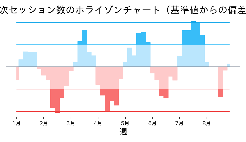
読み方のポイント #
- 色の濃さが増えるほど偏差が大きい領域です。温度図のようにピーク時期を捉えられます。
- 0ラインより下はマイナス偏差。暖色で塗り分けることで減少期を強調できます。
- 複数系列を横に並べると、限られたスペースでも季節パターンの差を比較しやすくなります。
いつ使うか #
- 適している場面: 多数の時系列を縦に圧縮して並べ、トレンドの概況を省スペースで比較したいとき。
- 不向きな場面: 折り返しの仕組みに慣れていない読者には直感的に理解しにくいため、説明が必要です。
- 代替手段: 一般的な聴衆にはスパークラインパネルの方が直感的に伝わりやすいです。
よくある失敗パターン #
- バンド数が多すぎる: 折り返しのバンド数を増やしすぎると色の重なりが複雑になり直感的に読めません。2〜3 バンドに抑えてください。
- 読み方の説明不足: ホライゾンチャートは馴染みが薄いため、説明なしに提示すると読者が混乱します。凡例と読み方の注釈を必ず付けてください。
- 積み上げエリアチャート — 構成比の時間推移を面で表現
- 複数ラインの推移比較 — 複数系列を同一軸で比較
- スパークラインパネル — 複数指標のミニ折れ線を格子に一覧