6.7.17
パレートチャートで主要要因を素早く特定
まとめ- パレート図で寄与度上位を棒+累積折れ線で表す。
ax.barとax.twinxで二軸構成にする定番テクニック。- 改善インパクトの大きい要因を特定するときに使う。
不良要因や問合せカテゴリなど、累積寄与の大きさを伝えるならパレートチャートが王道です。棒グラフと累積折れ線を組み合わせ、80/20 ルールの分岐点を明確にします。
 1
 2
 3
 4
 5
 6
 7
 8
 9
10
11
12
13
14
15
16
17
18
19
20
21
22
23
24
25
26
27
28
29
30
31
| import numpy as np
import matplotlib.pyplot as plt
from matplotlib.ticker import FuncFormatter
categories = ["設定ミス", "操作不明", "バグ", "仕様質問", "連携エラー", "その他"]
counts = np.array([120, 95, 70, 45, 30, 18])
sorted_idx = np.argsort(counts)[::-1]
counts = counts[sorted_idx]
categories = [categories[i] for i in sorted_idx]
cumulative = counts.cumsum() / counts.sum()
fig, ax1 = plt.subplots(figsize=(6.4, 4))
ax1.bar(categories, counts, color="#38bdf8")
ax1.set_ylabel("件数")
ax1.set_title("問い合わせカテゴリのパレート分析")
ax1.grid(axis="y", alpha=0.2)
ax2 = ax1.twinx()
ax2.plot(categories, cumulative, color="#ef4444", marker="o")
ax2.set_ylabel("累積比率")
ax2.set_ylim(0, 1.05)
ax2.yaxis.set_major_formatter(FuncFormatter(lambda x, _: f"{x:.0%}"))
threshold = np.argmax(cumulative >= 0.8)
ax2.axhline(0.8, color="#475569", linestyle="--", linewidth=1)
ax1.axvline(threshold + 0.5, color="#475569", linestyle=":", linewidth=1)
fig.tight_layout()
plt.show()
|
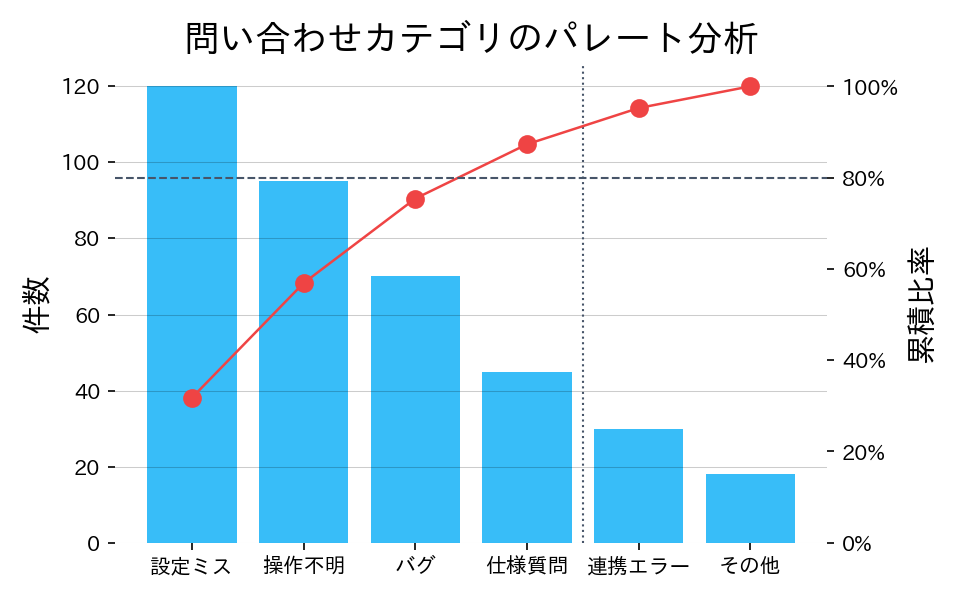
読み方のポイント
#
- 棒の高さで個別件数、折れ線で累積寄与率を合わせて確認できます。
- 80%ラインを引くと、重点的に対策すべきカテゴリが可視化されます。
- 累積線が緩やかに伸びる場合は、要因が分散しているため横断的な改善が必要だと判断できます。
いつ使うか
#
- 適している場面: 問題の主要な原因を特定し「重要な少数」に集中したいとき。品質管理の80/20法則の可視化に最適です。
- 不向きな場面: カテゴリ間の相互作用や原因の複合は表現できないため、因果分析には別途深掘りが必要です。
- 代替手段: 原因の構造的な関係を見たい場合はフィッシュボーン図などの定性手法を併用してください。
よくある失敗パターン
#
- 累積線の Y 軸スケール不一致: 棒グラフと累積線の Y 軸スケールが一致していないと 80% ラインの読み取りが不正確になります。右軸を 0〜100% に固定してください。
- カテゴリの粒度が不適切: 粒度が粗すぎると原因特定に役立たず、細かすぎると項目が多くて読みにくくなります。アクション可能な粒度に集約しましょう。