6.7.5
極座標の面積チャート
まとめ
- 極座標の棒グラフで月別データを円形に配置し季節性を俯瞰する。
subplot_kw=dict(polar=True)とax.barで極座標バーを描画。- 問い合わせ件数や売上など周期データのピーク月を直感的に把握したいときに使う。
月別の問い合わせ件数を極座標上で表現したチャートです。季節性の傾向を 360 度の円で確認できます。
| |
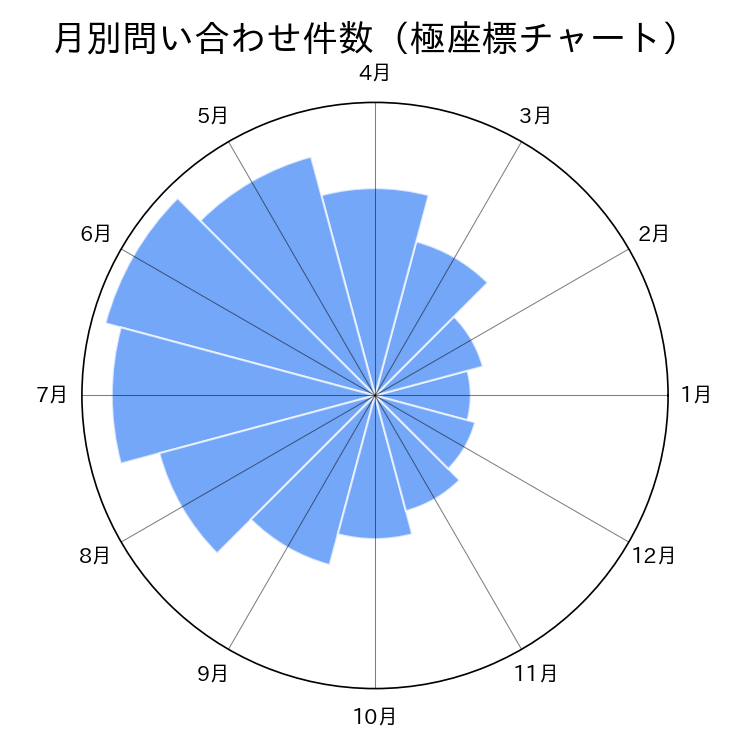
読み方のポイント #
- 半径が長いほど値が大きい。冬場の件数が夏場より少ないなど季節性を直感的に比較できる。
- 棒の幅(角度)を均一に保つことで月別比較がしやすくなる。
- 複数年を重ねる場合は透明度を変えるか、折れ線で表示すると見やすい。
いつ使うか #
- 適している場面: 周期的なデータ(月別・時間帯別など)を円形配置で季節性やパターンを俯瞰したいとき。
- 不向きな場面: 面積は半径の2乗に比例するため、大きいセクターの面積が過大に見え、値の差を誇張しがちです。
- 代替手段: 正確な値の比較が重要なら棒グラフにした方が長さで直感的に比較できます。
よくある失敗パターン #
- 面積の過大表示: 半径に比例させるとセクターの面積は2乗で増えるため大きい値が過剰に目立ちます。面積に比例させる(半径を sqrt にする)設計にしてください。
- セクター数が多すぎる: 12 以上のセクターがあると隣接セクター間の差が分かりにくくなります。月別(12)程度までに抑えましょう。