6.7.15
スパイラルプロットで年内の周期を描き出す
まとめ
- 日次データを極座標上に螺旋状に配置し、年間の周期パターンを描き出す。
projection="polar"とax.plotで螺旋曲線を描画しfill_betweenで塗る。- 週次・月次の周期性やピーク期間を発見したいときに使う。
年間のトレンドを一周の円に押し込み、経過日数で螺旋状に積み重ねると、季節性や周期のズレが見えやすくなります。極座標に変換するだけでユニークな可視化ができます。
| |
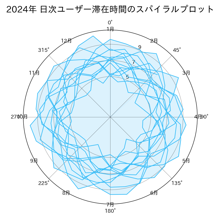
読み方のポイント #
- 螺旋上で半径が大きくなるほど、値が伸びた期間。外側で太っている月がピークです。
- 周期性が強ければ、同じ角度付近で波形が繰り返されます。
- 一周を何日で割るかを調整すると、週次・月次など好みの周期で可視化できます。
いつ使うか #
- 適している場面: 年単位の周期性(季節変動)を螺旋状に重ねて年ごとのパターン比較をしたいとき。
- 不向きな場面: 螺旋の内側と外側で同じ角度でもアーク長が異なるため、値の正確な比較が困難です。
- 代替手段: 折れ線グラフを年ごとに重ね描きする方がパターン比較をより正確に行えます。
よくある失敗パターン #
- 内周と外周の弧長の違い: 螺旋の内側と外側では同じ角度でもアーク長が異なるため、値の面積表現が歪みます。色やラベルで補足してください。
- 読者の馴染みの薄さ: 螺旋形は日常的でないため直感的に読めない人が多いです。凡例や読み方の注釈を必ず添えましょう。
- カレンダーヒートマップ — 年間の日別指標を曜日×週で俯瞰
- 極座標の面積チャート — 円形配置で季節性や周期を俯瞰
- ストリームグラフ — 構成比の推移を上下対称の波で表現