6.3.5
ダイバージングバーで差分を表す
まとめ
- 正負の値を中央線の左右に振り分けて増減を視覚化する。
ax.barhとnp.whereによる条件付き色分けで正負を区別する。- 前年比やスコア差などプラス・マイナスの傾向を伝えたいときに最適。
- 基本の縦型棒グラフ の概念を先に学ぶと理解がスムーズです
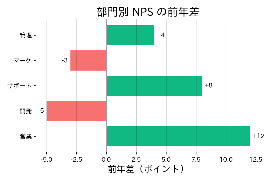
前年との増減を横向きの棒で表現すると、プラス・マイナスの傾向がすぐに読み取れます。
| |
読み方のポイント #
- 中央線を 0 にすることで増減の方向が明確になる。
- 色をプラスとマイナスで変えると、直感的に把握しやすい。
- 変化量が小さい場合はパーセント表示や注釈を加えて強調する。
いつ使うか #
- 適している場面: 正負や賛否など中央基準からの差分を左右に表示したいとき。アンケート結果の表現に最適です。
- 不向きな場面: 値がすべて正の場合はダイバージング形式にする意味がなく、通常の棒グラフの方が明快です。
- 代替手段: ダンベルチャートでビフォー・アフターの変化量を直線で結ぶとさらに差分が際立ちます。
よくある失敗パターン #
- 中央基準の設定ミス: 中央のゼロ線が適切でないと正負の解釈が混乱します。基準値を明確にラベル付けしてください。
- 正負の色が紛らわしい: 正と負に似た色を使うと一瞥で方向が判断できません。赤/青など直感的に対比できる色を選びましょう。
- 横向き棒グラフ — ラベルが長い項目を横向きで比較
- ダンベルチャート — 2時点の差分を線と点で強調
- ウォーターフォールチャート — 増減要因を段階的に積み上げ