6.3.3
グループ化棒グラフ
まとめ
- 複数カテゴリの値を並列に並べて比較するグループ化棒グラフ。
ax.barをnumpy.arangeでずらして複数系列を横並びに描画する。- チャネル別・期間別など2軸の比較に向いている。
- 基本の縦型棒グラフ の概念を先に学ぶと理解がスムーズです
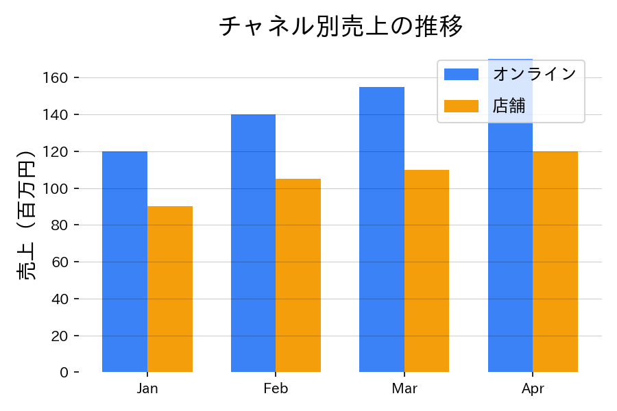
月別の売上をチャネル別に並べ、増減を比較する例です。幅を調整してグループ間に余白を持たせます。
| |
読み方のポイント #
- 凡例の順序は棒の描画順と合わせる。
- グリッドや注釈で差分を補助すれば、数値に注目してもらいやすい。
- 棒が増えすぎると読みにくくなるため、チャネル数は3~4程度に抑えるのが無難。
いつ使うか #
- 適している場面: 2つのカテゴリ軸(例:地域×年度)で値を並列比較したいとき。
- 不向きな場面: グループ数やカテゴリ数が多いと棒が細くなりすぎて読みにくくなります。
- 代替手段: ヒートマップにすれば多数のカテゴリ組み合わせを色で一覧できます。
よくある失敗パターン #
- グループ数が多すぎる: 1つのカテゴリに5色以上の棒を並べると区別が困難になります。3色以内に抑えるか、ファセットに分割してください。
- 色の識別困難: 似た色を使うとグループの区別がつきません。色覚多様性にも配慮した明確に異なるパレットを選びましょう。