6.3.2
横向き棒グラフでランキング表示
まとめ
- ラベルが長い項目を横向きの棒で見やすく比較する。
ax.barhとax.bar_labelで横棒グラフと値ラベルを描画する。- ランキングやアンケート結果など項目名が長い場合に最適。
アンケート結果のようにラベルが長いときは横向きの棒グラフが適しています。
| |
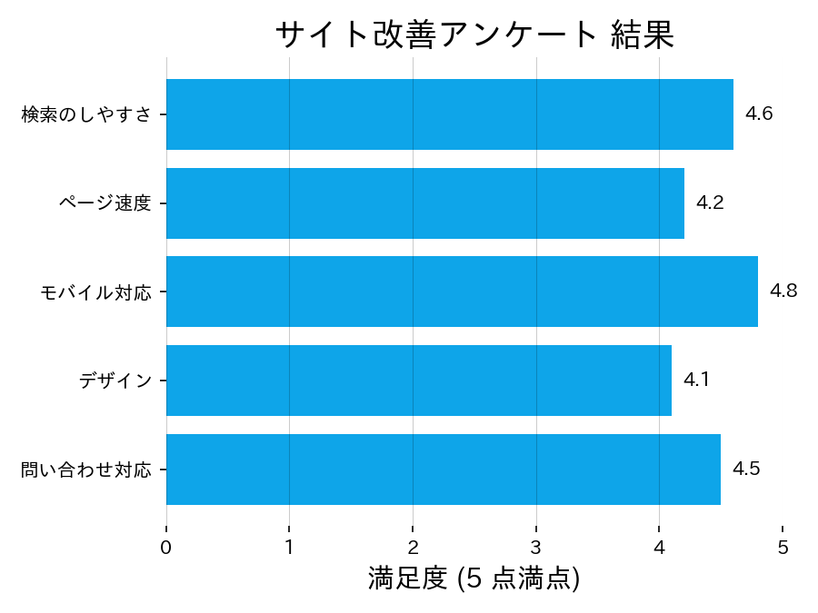
読み方のポイント #
- 項目数が多いときは横棒が視線移動しやすい。
- 値を降順に並べるとランキングが明確になる。
- 棒の色を統一し、強調が必要な場合のみ別色を使う。
いつ使うか #
- 適している場面: ラベルが長いカテゴリのランキングを表示したいとき。横向きならラベルが読みやすくなります。
- 不向きな場面: 時系列データには適さないため、時間軸がある場合は折れ線グラフを使ってください。
- 代替手段: 値の差分を強調したいならダンベルチャートの方が変化量を際立たせられます。
よくある失敗パターン #
- ソートされていないランキング: 値の順序で並べないとランキングとしての意味が薄れ、読者が比較しにくくなります。降順にソートしてください。
- 棒の間隔が不均一: カテゴリ間の間隔がバラバラだと視覚的にグルーピングがあるように誤解されます。等間隔に揃えましょう。