6.3.7
ロリポップチャートでシンプルに比較
まとめ
- 線と点で値を表す、棒グラフより軽量な比較表現。
ax.hlinesとax.plotで線分とマーカーを組み合わせて描画する。- 項目数が多くインクを減らしたいときや、棒グラフの代替として有効。
- 基本の縦型棒グラフ の概念を先に学ぶと理解がスムーズです
棒の代わりに線と点で表現するロリポップチャートは、項目が多いときでも軽やかに比較できます。
| |
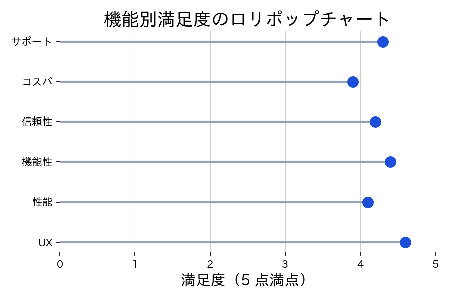
読み方のポイント #
- 点の色や形でカテゴリーを追加で表現できる。
- 長さに集中してほしい場合は背景をシンプルに保つ。
- 値を表示するときは点の右側に小さく添えると視線の流れを邪魔しない。
いつ使うか #
- 適している場面: 棒グラフよりもすっきりした見た目で値を比較したいとき。カテゴリ数がやや多くても読みやすいです。
- 不向きな場面: 構成比(内訳)を表現したい場合には不向きで、積み上げ棒グラフの方が適切です。
- 代替手段: カテゴリ数が少ない場合はシンプルな縦棒グラフの方が馴染みやすい表現です。
よくある失敗パターン #
- ベースラインが 0 でない: 線の始点が 0 でないと長さが値に比例せず、視覚的に誤解を招きます。Y 軸は 0 から始めてください。
- マーカーのサイズが不適切: マーカーが小さすぎると棒グラフとの差別化が失われ、大きすぎると隣のデータと重なります。適切なサイズを選びましょう。