6.3.4
積み上げ棒グラフで構成比を示す
まとめ
- 複数系列を1本の棒に積み上げて全体量と内訳を同時に示す。
ax.barのbottom引数で系列を累積的に積み上げる。- 合計値の推移と構成比の変化を一度に把握したいときに使う。
- 基本の縦型棒グラフ の概念を先に学ぶと理解がスムーズです
月別総売上をチャネル別に積み上げると、全体量と構成比を同時に見ることができます。
| |
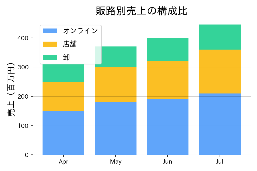
読み方のポイント #
- パーセント表示にしたい場合は、各系列を合計で割った 100% スタックにすると良い。
- 月ごとの合計値に注目してもらいたい場合は、合計線を上に重ねるのも一案。
- 下から順に主要チャネルを並べると凡例との対応が分かりやすい。
いつ使うか #
- 適している場面: 各カテゴリの内訳と合計値を同時に見たいとき。部分と全体の関係を表現できます。
- 不向きな場面: 最下段以外のセグメントはベースラインが揃わないため、個別の長さの正確な比較には向きません。
- 代替手段: 100%積み上げ棒グラフにすれば合計を揃えて構成比の比較に特化できます。
よくある失敗パターン #
- ベースラインが不揃いなセグメントの比較: 最下段以外のセグメントはベースラインが揃わないため長さの比較が困難です。比較したいカテゴリを最下段に置くか、別図で補足してください。
- セグメント数が多すぎる: 5色以上のセグメントに分けると個々の寄与が見えにくくなります。主要な3〜4カテゴリに集約し、残りを「その他」にまとめましょう。
- グループ化棒グラフ — 複数カテゴリを並列で比較
- ワッフルチャート — 100マスで構成比を直感的に表示
- 積み上げエリアチャート — 構成比の時間推移を面で表現