6.3.8
ワッフルチャートで構成比をタイル表示
まとめ
- 100個のタイルで構成比を直感的に伝えるワッフルチャート。
matplotlib.patches.Rectangleでグリッド状のタイルを色分けして描画する。- 円グラフの代替として、割合をざっくり比較したいときに使う。
- 基本の縦型棒グラフ の概念を先に学ぶと理解がスムーズです
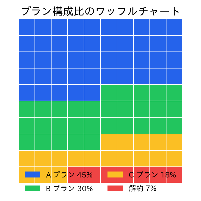
100 個のタイルにカテゴリのシェアを割り当てるワッフルチャートは、比率をざっくり伝えるのに便利です。
| |
読み方のポイント #
- ブロック数を 100 個に固定すると割合が直感的に理解できる。
- 凡例にパーセントを併記することで正確な値も伝えられる。
- グリッド線を消すと柔らかい印象、残すと正方形の並びが強調される。
いつ使うか #
- 適している場面: 構成比率を直感的なタイル(セル)数で伝えたいとき。100個のマスで割合を示す表現が分かりやすいです。
- 不向きな場面: 小数点以下の細かい割合を正確に表現するのは難しく、精度が求められる場面には適しません。
- 代替手段: 正確な割合の比較にはドーナツチャートや棒グラフの方が適しています。
よくある失敗パターン #
- セル数が中途半端: 100 セル以外(例えば 50 セル)を使うと割合の解釈が直感的でなくなります。100 セルを基本にしてください。
- カテゴリ数が多すぎる: 6 色以上に分けるとセルの色を区別しにくくなります。4〜5 カテゴリ以下に集約するのが望ましいです。