6.2.6
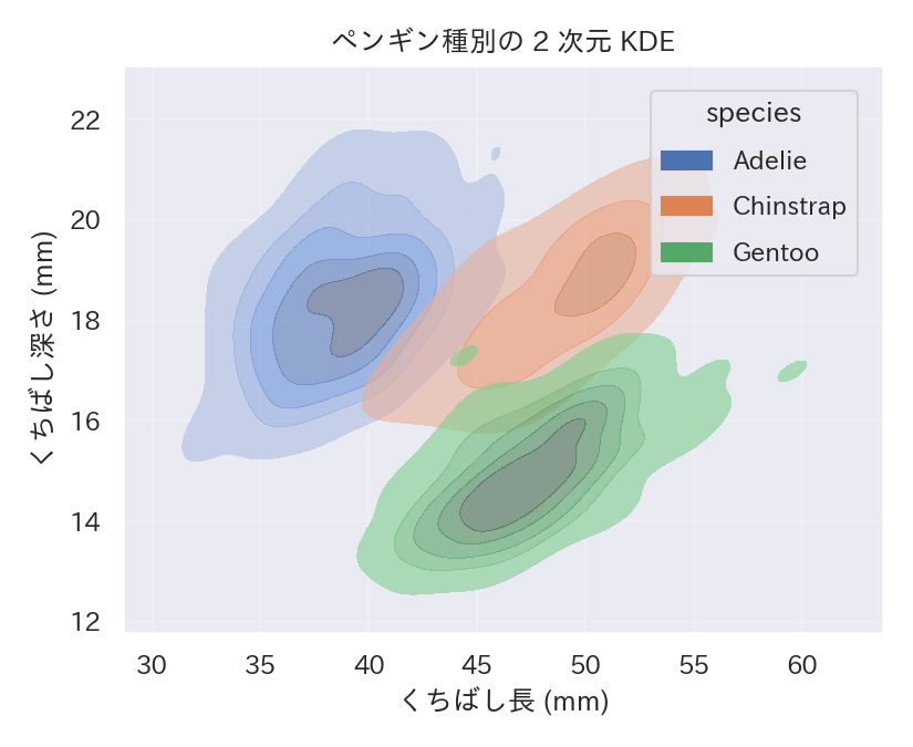
2次元 KDE で密度を等高線表示
まとめ
- 2変数の密度を等高線・塗りつぶしで表示する。
sns.kdeplotにx, yを指定して2次元描画。- 散布図が密集して見づらいときに使う。
- 密度プロット の概念を先に学ぶと理解がスムーズです
seaborn.kdeplot を使うと 2 変数の密度を等高線または塗りつぶしで描けます。散布図が密集しているときに有効です。
| |
読み方のポイント #
- 等高線が密な箇所ほどデータが集まっている。色の濃淡で頻度を直感的に把握できる。
threshを調整すると僅かな密度の輪郭を省略できる。- 大量データでは計算が重い場合があるため、サンプリングや
bw_adjustで帯域を調整する。
いつ使うか #
- 適している場面: 2変数の同時分布を等高線で表示したいとき。密集領域と疎な領域を滑らかに描けます。
- 不向きな場面: 帯域幅パラメータの選択で結果が大きく変わるため、パラメータ感度に注意が必要です。
- 代替手段: Hexbin プロットを使えばパラメータ依存なくデータの密度分布を可視化できます。
よくある失敗パターン #
- 帯域幅の過剰な平滑化: 帯域幅が大きすぎるとデータの局所構造(クラスタ等)が消えてしまいます。複数の帯域幅を試して確認してください。
- 等高線レベルの不適切な設定: レベル数が少なすぎると密度の勾配が伝わらず、多すぎると煩雑になります。5〜10 段階を目安に調整しましょう。
- 密度プロット — 分布を滑らかな曲線で可視化
- Jointplot — 散布図と周辺分布を同時に表示
- Hexbinプロット — 六角形ビンで散布の密度を集約