6.2.9
Swarmplot で個々のデータを重ならず配置
まとめ
- 個々のデータ点を重ならず配置して分布を表示。
sns.swarmplotでカテゴリ別に点を描画。- 少量データの分布と個票を同時に見たいときに使う。
Swarmplot は各データ点を重ならないようにずらして配置することで、個々の値を保ちながら分布の形を表現できます。
| |
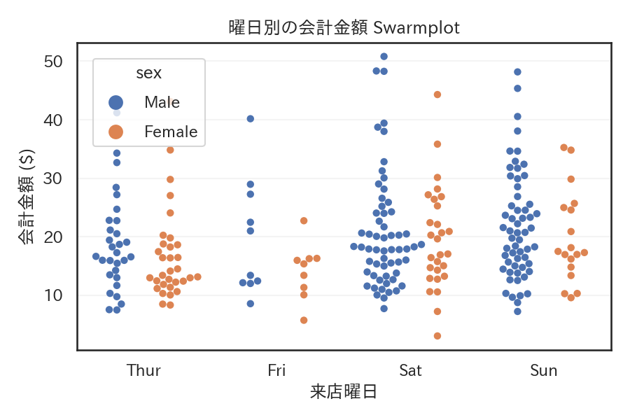
読み方のポイント #
- 点が一列に並ぶ高さが密度の高さを示す。外れ値も点として残るので見逃しにくい。
- データ数が非常に多い場合は計算が重いので、サンプリングや
sizeの調整が必要。 dodge=Trueを使うと hue のカテゴリごとに列を分けて比較できる。
いつ使うか #
- 適している場面: 個々のデータ点を重ならないよう配置して分布形状と個票を同時に見たいとき。
- 不向きな場面: データ点が多い(数百点超)と配置に時間がかかり、描画も密集して読みにくくなります。
- 代替手段: 大量データにはバイオリンプロットやストリップを重ねた方が効率的です。
よくある失敗パターン #
- データ数が多すぎて描画が遅い: 数百点を超えると点の配置計算に時間がかかり、結果も密集して読みにくくなります。サンプリングするか strip plot に切り替えてください。
- カテゴリ間で幅が不均一: データ数の多いカテゴリだけ横に広がり、視覚的にバランスが悪くなります。各カテゴリの n 数を注記して補足しましょう。