6.4.4
二軸グラフで異なる指標を同時に表示
まとめ
- 二軸グラフで単位の異なる2指標(売上とCVR)を同時に表示する。
ax.twinx()で右側に第2軸を追加し、それぞれの系列を描画する。- スケールが異なる指標の相関や推移を1枚で比較したいときに使う。
- 複数ラインの推移比較 の概念を先に学ぶと理解がスムーズです
片方の軸で売上高、もう片方でコンバージョン率を表示する例です。Axes.twinx() を使って右軸を追加します。
| |
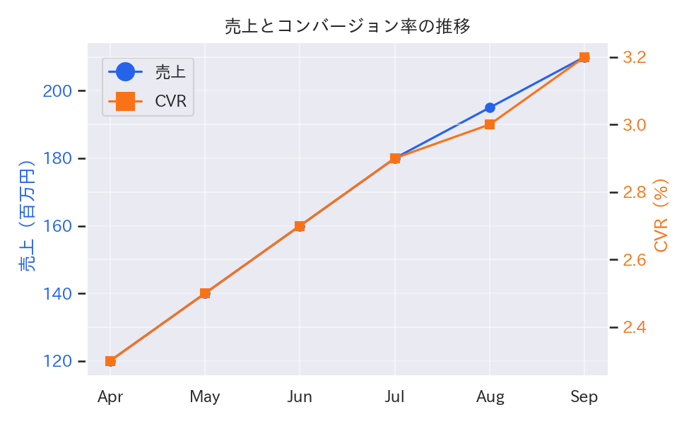
読み方のポイント #
- 目盛りの色を線と揃えると軸の対応が分かりやすい。
- スケールが極端に異なる場合はデータを標準化するか、別図に分けることも検討する。
- 過剰に使うと混乱を招くので、関係性を強調したい指標に限定する。
いつ使うか #
- 適している場面: 単位の異なる2つの指標のトレンドを同一時間軸で比較したいとき。
- 不向きな場面: 2軸のスケールが恣意的に設定できるため、因果関係がないのに相関があるように見せてしまう危険があります。
- 代替手段: 正規化して同一軸にプロットするか、ファセットで上下に分ける方が誤解を避けられます。
よくある失敗パターン #
- スケールの恣意的な調整: 2つの Y 軸のスケールを都合よく調整すると、実際には無関係な2指標がぴったり連動しているように見えます。スケールの設定根拠を明記してください。
- 因果関係の誤認: 2軸のトレンドが一致しているだけで因果関係があると誤解させてしまいます。相関と因果を区別する注釈を加えましょう。
- 複数ラインの推移比較 — 複数系列を同一軸で比較
- 注目期間ハイライト — 特定期間を背景色で強調
- ステップライン — 段階的な値の変化を階段状に表現