6.4.7
予測区間をバンドで表現
まとめ
- 予測値と信頼区間を帯(バンド)で同時に可視化する。
ax.fill_betweenで上下限を半透明の帯として描画する。- モデル予測の不確実性を視覚的に伝えたいときに使う。
- 複数ラインの推移比較 の概念を先に学ぶと理解がスムーズです
機械学習モデルの予測値と、その上下限を fill_between で帯状に描画すると、不確実性も合わせて伝えられます。
| |
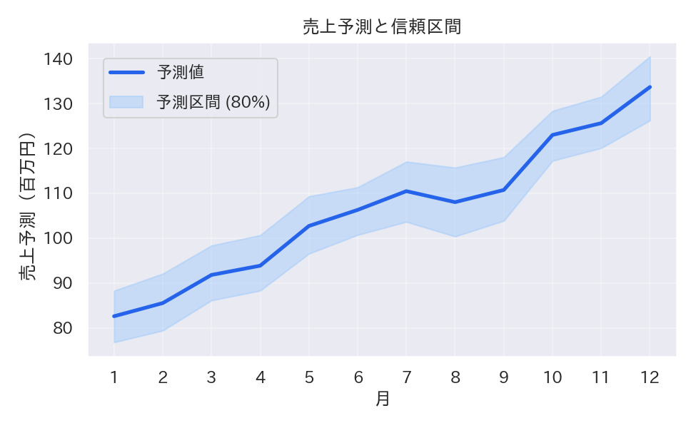
読み方のポイント #
- バンドの透明度を上げすぎると折れ線が見づらくなるので 0.3〜0.4 程度が目安。
- 予測区間の幅が広い箇所は不確実性が高いため、追加データの収集やモデル改善を検討できる。
- 予測値と実績を重ねる場合は、色や線種を変えて見間違いを防ぐ。
いつ使うか #
- 適している場面: 予測値とその不確実性(信頼区間)を同時に示したいとき。リスクの大きさを帯の幅で伝えられます。
- 不向きな場面: 予測区間の前提(信頼水準等)を明記しないと、帯の解釈で読者を誤解させる恐れがあります。
- 代替手段: 複数シナリオの比較にはファンチャート(扇形グラフ)を使うとより多段階の不確実性を表現できます。
よくある失敗パターン #
- 信頼水準の未記載: 予測区間が 80% なのか 95% なのかを明示しないと読者が不確実性の度合いを正しく判断できません。必ず信頼水準をラベルに記載してください。
- 過去の実績線と予測線の区別不足: 実績と予測を同じ線種・色で描くと境界が分かりません。予測部分を破線にするか色を変えて区別しましょう。
- 注目期間ハイライト — 特定期間を背景色で強調
- 複数ラインの推移比較 — 複数系列を同一軸で比較
- 移動平均 — ノイズを平滑化しトレンドを把握