6.4.6
注目期間をハイライトする
まとめ
- 折れ線グラフの特定期間を背景色でハイライトし注目区間を強調する。
ax.axvspanで任意の期間に半透明の帯を描画する。- キャンペーンや繁忙期など、イベント前後の変化を強調したいときに使う。
- 複数ラインの推移比較 の概念を先に学ぶと理解がスムーズです
通常の折れ線に ax.axvspan を組み合わせると、特定期間を背景色で強調できます。大型キャンペーン期間などに便利です。
| |
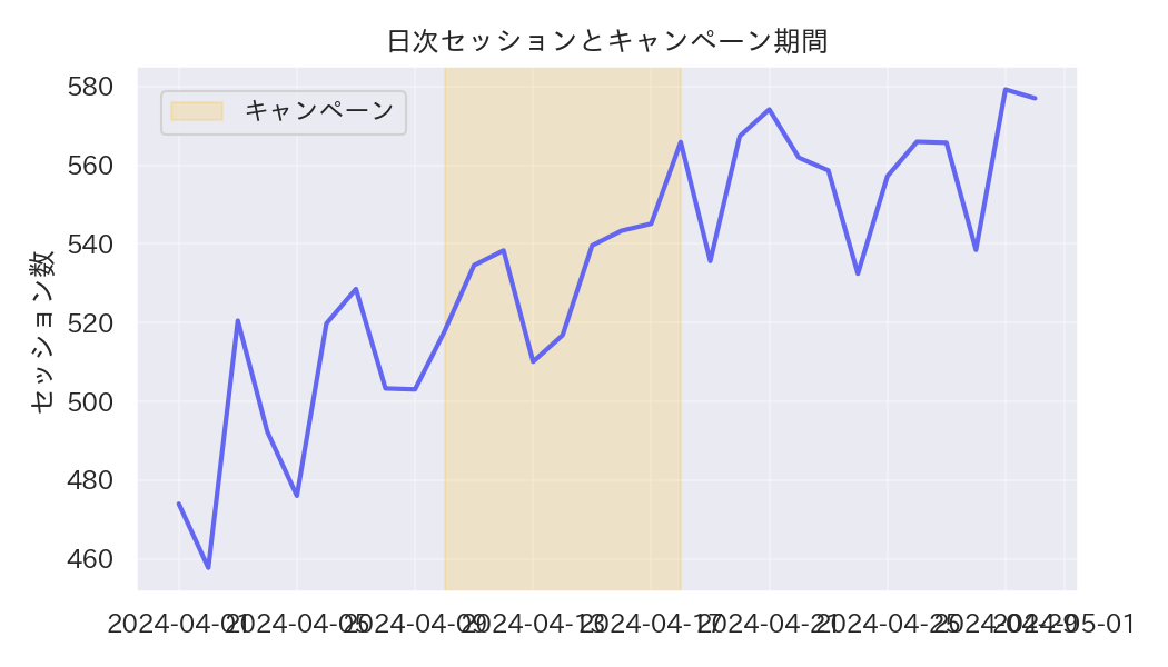
読み方のポイント #
- 背景色は淡い色にし、折れ線よりも目立ち過ぎないようにする。
- 期間を複数指定する場合は色分けやストライプなどで区別する。
- 注釈を加えてイベント名や施策名を記録しておくと分析メモになる。
いつ使うか #
- 適している場面: 特定の期間(イベント期間やキャンペーン期間など)を視覚的に強調したいとき。
- 不向きな場面: ハイライト区間が多すぎると逆に注目すべき箇所が曖昧になり、効果が薄れます。
- 代替手段: イベント前後の差を定量的に比較したい場合はダイバージングバーの方が数値差が明確です。
よくある失敗パターン #
- ハイライト区間が多すぎる: 注目期間を何箇所もハイライトするとどこが重要か分からなくなります。本当に重要な1〜2区間に絞りましょう。
- ハイライトの色が線と紛らわしい: 折れ線と同色でハイライトすると区間の境界が見えません。薄い背景色など控えめな色にしてください。
- 複数ラインの推移比較 — 複数系列を同一軸で比較
- 予測区間バンド — 予測値と信頼区間を帯で表現
- 二軸グラフ — 単位の異なる2指標を同時に表示