6.5.6
カテゴリ別の散布図に注釈を追加
まとめ
- カテゴリ別に色分けし、平均線や注釈で洞察を補足した散布図。
ax.annotateとaxvline/axhlineで基準線・矢印付き注釈を追加する。- グループ間の違いや注目領域を第三者に説明するプレゼン用途で使う。
- 散布図の基本形 の概念を先に学ぶと理解がスムーズです
クラスタごとに色分けし、平均値ラインと注釈を加えた散布図です。注目してほしい領域をテキストで示すと伝わりやすくなります。
| |
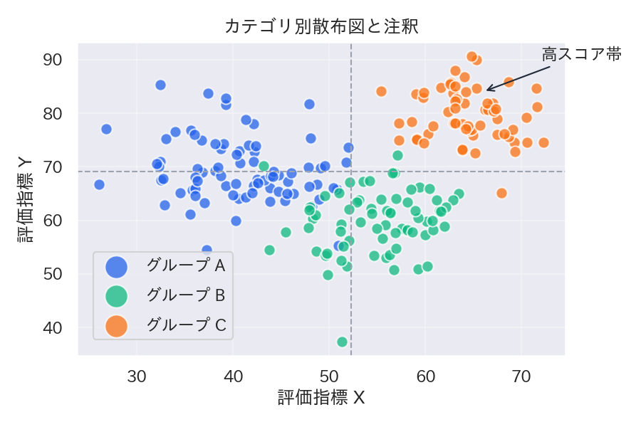
読み方のポイント #
- 平均線を描くと全体の基準が分かり、各クラスターの位置付けを説明しやすくなる。
- 注釈は矢印やハイライトと組み合わせると視線が誘導できる。
- 凡例の順序を重視順・規模順に並べ替えると、意思決定者への説明がスムーズ。
いつ使うか #
- 適している場面: カテゴリごとの散布点にラベルや注釈を付けて特徴的なデータ点を強調したいとき。
- 不向きな場面: 注釈が多すぎるとラベルが重なり読めなくなるため、数十点以上ある場合は厳選が必要です。
- 代替手段: インタラクティブなツールチップ付きプロット(Plotly等)にすればホバーで全点の情報を確認できます。
よくある失敗パターン #
- ラベルの重なり: 注釈が密集するとテキストが重なり判読不能になります。adjustText ライブラリや手動オフセットで重なりを解消してください。
- 注釈の付けすぎ: すべてのデータ点に注釈を付けると情報過多でかえって読めません。特徴的な点だけに絞って注釈するのが効果的です。